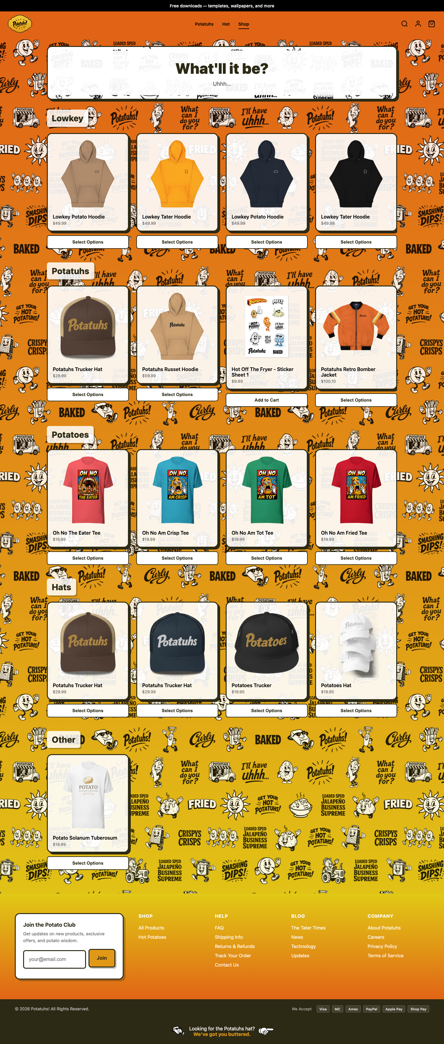
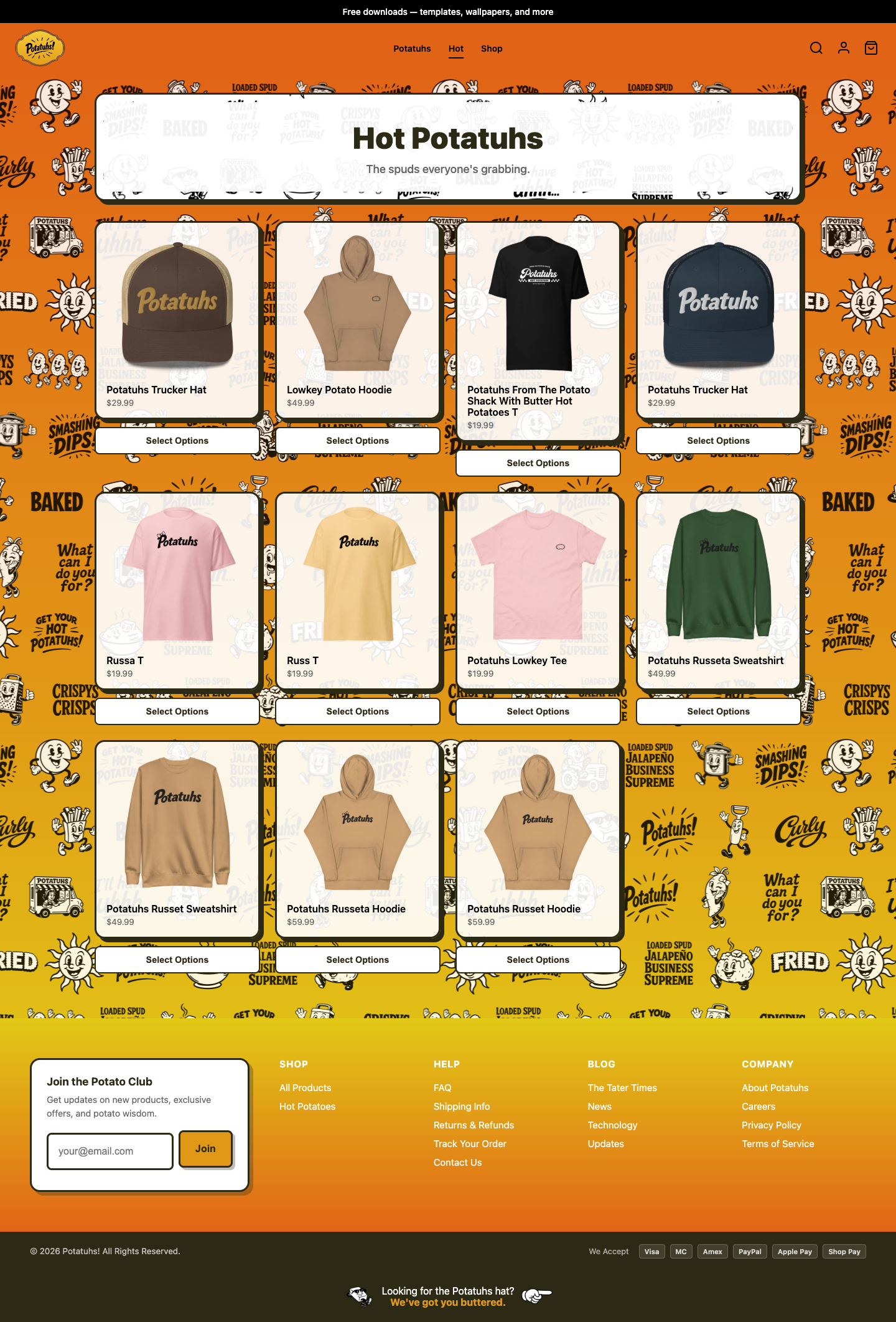
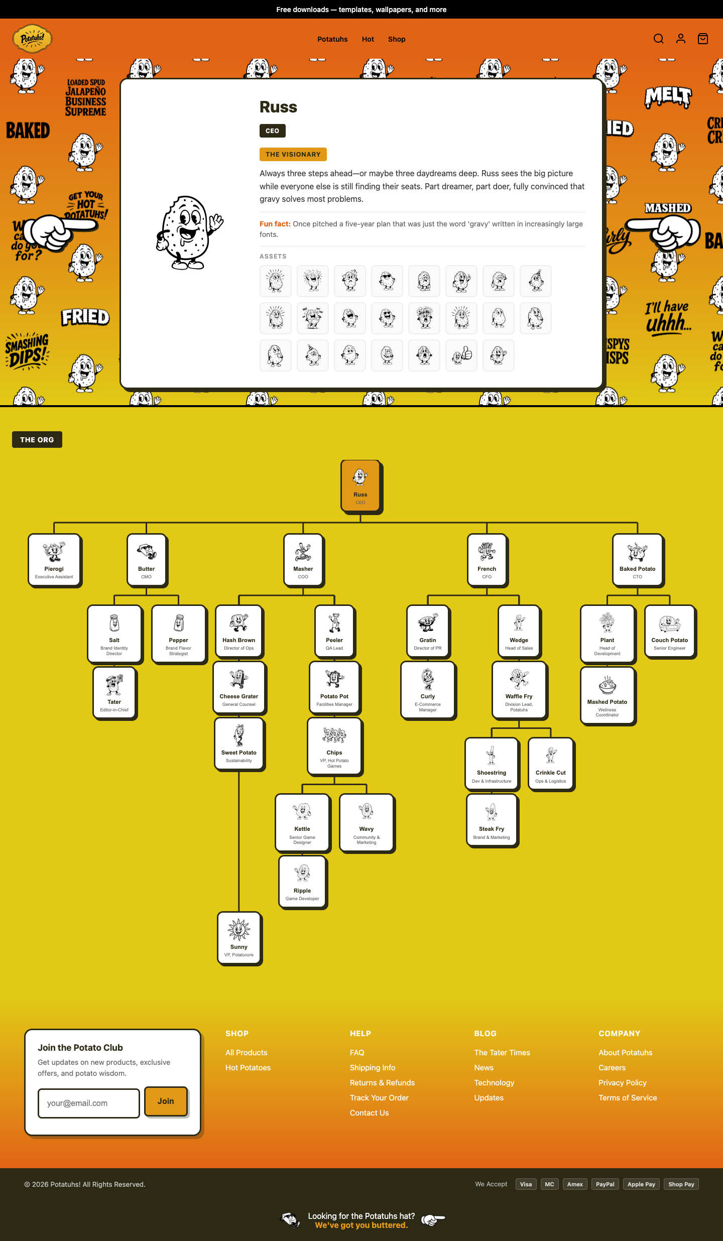
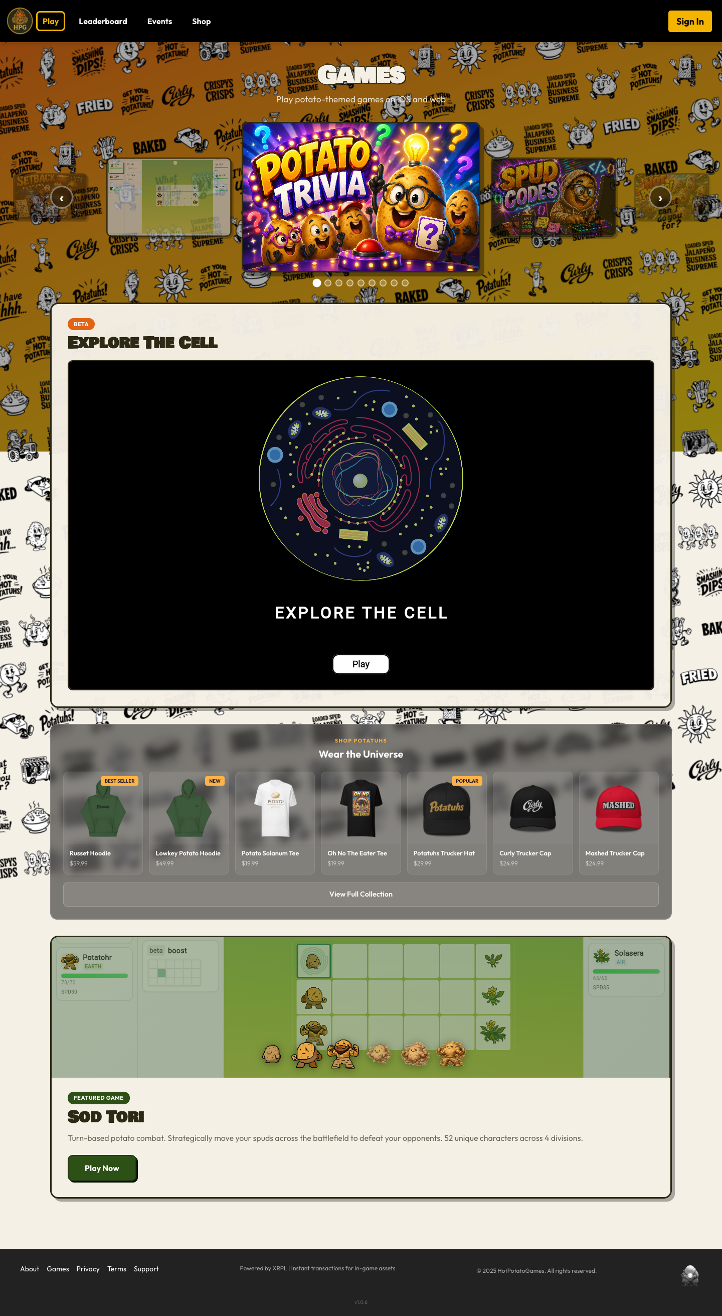
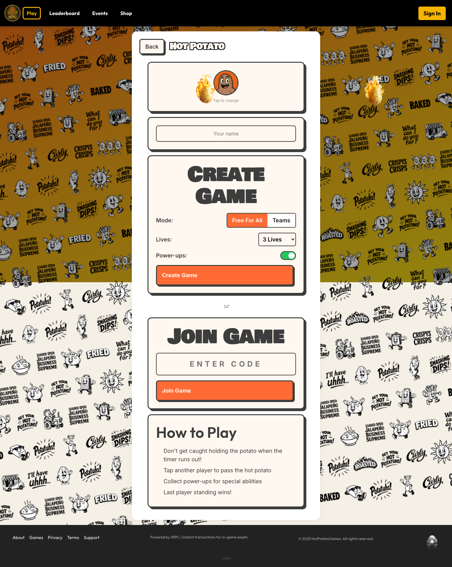
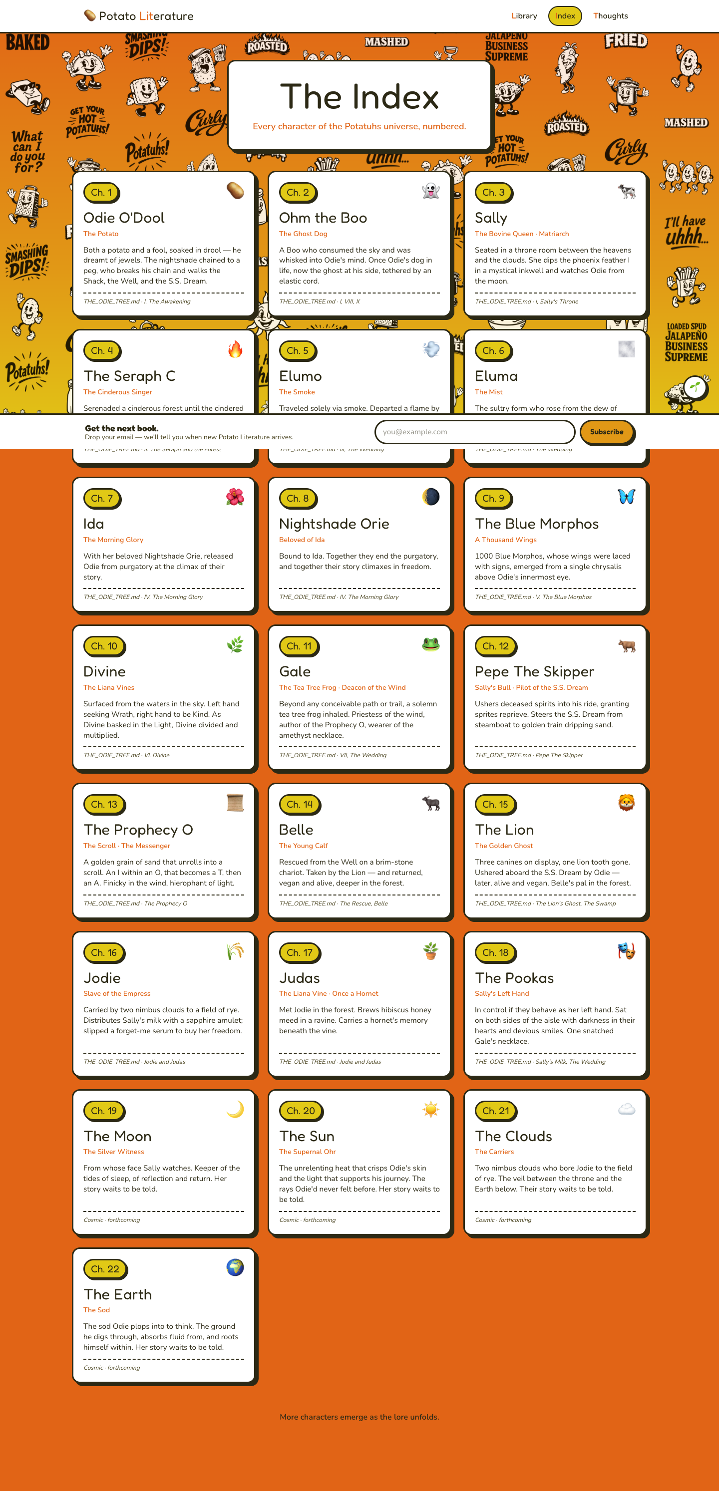
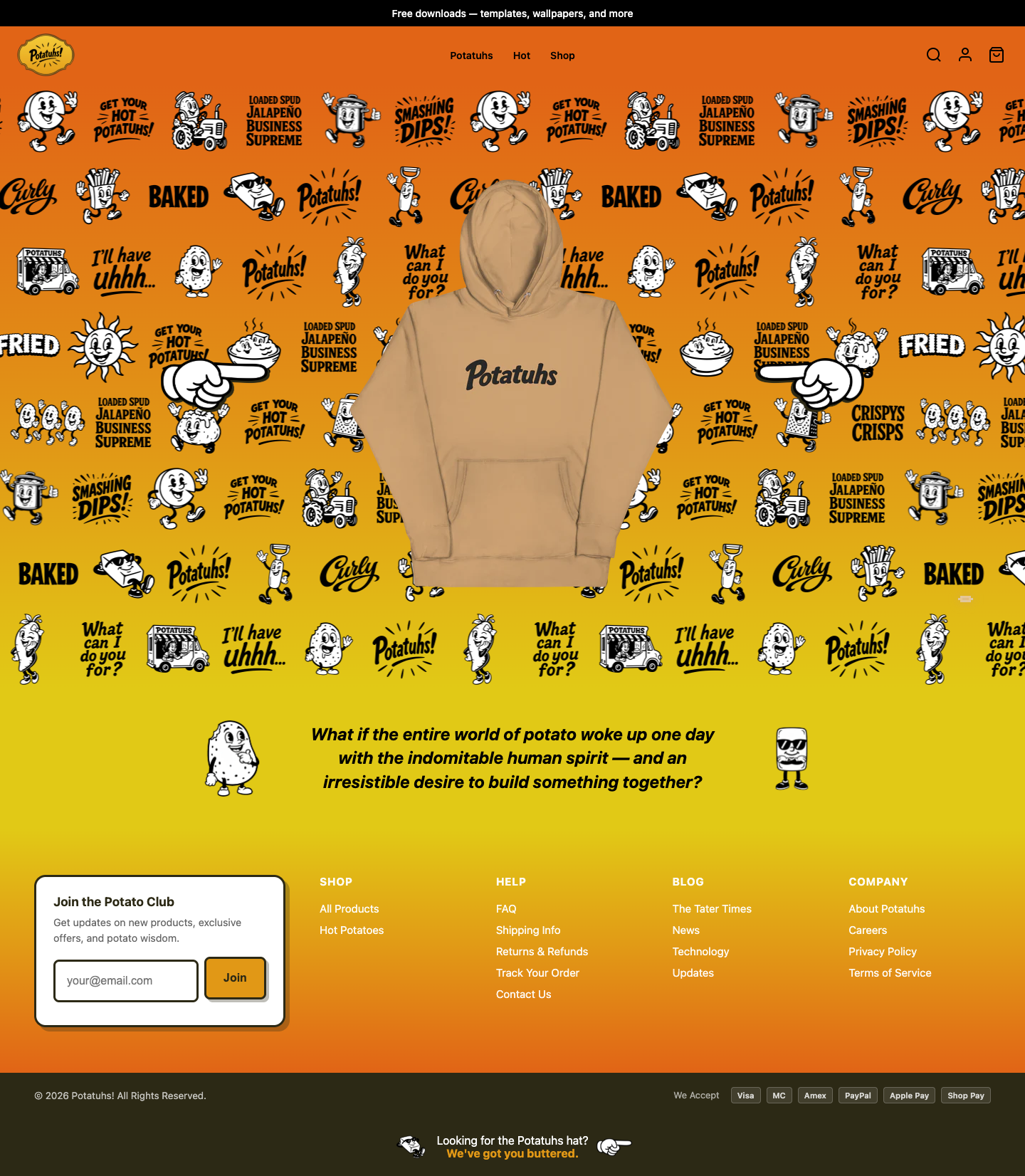
Annual 2026
The Potatuhs Annual
THE
ANNUAL
52 Employees Reviewed Our Websites. None of Them Agreed. All of Them Were Right.
52 PAGES  ·  4 DIVISIONS  ·  52 CHARACTERS  ·  2026
Editor's Note

We asked every employee in the company to do one thing: look at our websites and tell us what they saw. Not what they hoped to see. Not what the roadmap promised. What is actually there, on screen, right now.

Fifty-two potatoes looked at the same pixels and came back with fifty-two different reports. That is what is supposed to happen when you staff a company correctly.

Waffle Fry looked at potatuhs.com and counted 114 commits. She said the storefront "finally communicates what we are without flinching." Wedge looked at the same homepage and said it has no call-to-action button -- not one -- and that every second a customer spends deciding where to click is a second closer to leaving. They are both right. They are both looking at the same page. That is the tension that makes this company work.

Hot Potato Games discovered that the platform has forty games and not a single share button. Flamin' Hot called it "a rocket with no countdown clock." Sour Cream and Onion found that Cursor Combat loads to a title screen and nothing else. The Potatocore division found that their entire production studio website runs on three source files. Potato Bug, the sound designer, reviewed a completely silent website and argued that the silence is the sound design. Potato Battery counted those three files and said, "Three files do not have performance problems. They have ambition problems."

And then there is Potato Literature. Pee Wee, the publishing intern, found a localStorage key called `potato-reader` and wrote, "That is what I am. A potato, reading." Hasselback, the essayist, looked at the same site and wrote, "The architecture anticipates a library. The library contains a pamphlet." The intern found hope in a variable name. The critic found an indictment in an empty shelf. Both are accurate assessments of a publishing house at version 0.1.0.

What surprised me most was what every division found independently: the infrastructure is ahead of the content. The systems are built. The shelves are assembled. The pages load. But the shelves are not full, the pages are not populated, and the machinery is waiting for material that has not arrived yet. We built the factory before we grew the potatoes.

The market research was conclusive. We have work to do.

— Butter, CMO & Editor-in-Chief

Potatuhs

potatuhs.com
A♦ Waffle Fry  ·  K♦ Fries  ·  Q♦ Curly  ·  J♦ Wedge  ·  10♦ Crinkle Cut  ·  9♦ Shoestring  ·  8♦ Steak Fry  ·  7♦ Sweet Potato Fry  ·  6♦ Tater Tot  ·  5♦ Truffle Fry  ·  4♦ Garlic Fry  ·  3♦ Chili Fry  ·  2♦ Saucy Fry
A♦  ·  Division Head

The Storefront Holds. The Vision Is Landing.

As Division Head, I need to know if potatuhs.com is doing what we built it to do — represent this company to anyone who finds us.
potatuhs.com
homepage.png — The single hoodie against the character art wallpaper is the brand thesis in one image.

114 commits since January. That is not a number I take lightly. That is 114 decisions about what this company looks like to the outside world, and I can report that the aggregate effect is a storefront that finally communicates what we are without flinching. The homepage hero — a single hoodie floating against a wall of character art — tells the story in one scroll. We are a product company backed by a universe. Not the other way around.

The about page is the strongest it has ever been. "What if the entire world of potato woke up one day with the indomitable human spirit — and an irresistible desire to build something together?" That is the premise, stated plainly, with no apology. Below it, the mission, the values, the characters. The org chart page, added just two days before this review, puts real structure on public display. We are showing the whiteboard now. That takes confidence.

The product catalog is organized into clear collections — Hoodies, Hot Potatoes, Accessories — and the featured product tagging system (featured1 through featured8) gives us editorial control over what surfaces first. Good. The "Hot Potatoes" collection functions as a curated best-of, which is the right instinct for a growing catalog.

Where I pause: the Accessories collection is empty. "No products in this collection yet" is a sentence that should not be visible on a live site. It signals incompleteness to the customer. Either stock it or hide it. The search page also feels utilitarian — no predictive results, no visual richness. These are small things, but they are the difference between a storefront that works and one that impresses.

The footer newsletter CTA — "Join the Potato Club" — is everywhere it should be. The announcement bar offers free downloads. The payment badges are visible. The bones are right. Now we build the muscle.

K♦  ·  Director of Finance & Revenue

The Revenue Path Exists. It Needs Guardrails.

As Director of Finance & Revenue, I am looking at every pixel between "I want that" and "order confirmed" — and counting the places we lose people.
potatuhs.com
cart.png — The empty cart state offers one exit and zero product suggestions. That is leaving revenue on the table.

The good news is that potatuhs.com has a conversion path. Products display prices. "Select Options" buttons are visible on product cards. The cart page exists and functions. Payment methods are displayed in the footer — Visa, MC, Amex, PayPal, Apple Pay, Shop Pay. Six options. That is healthy coverage for an emerging brand. Shop Pay alone has been shown to increase checkout conversion by double digits among repeat customers.

Now the concerns. The Hot Potatoes collection shows products ranging from trucker hats to hoodies to tees, but the pricing display is inconsistent. Some cards show a single price, others show "Select Options" without surfacing the price at all. A customer should never have to click to learn what something costs. Price visibility is not a design choice — it is a revenue requirement.

The cart page, when empty, shows "Looks like you haven't added anything yet, let's get you started!" followed by a single "Continue shopping" link. That is a dead end with a smile. An empty cart is a conversion opportunity — show bestsellers, show the Hot Potatoes collection, show something that earns the next click. Every empty state is either a recovery point or an exit. Right now, it is an exit.

I do not see order tracking or account creation prominently surfaced. The footer mentions "Track Your Order" but the path from purchase to post-purchase loyalty is not visible in the main navigation. Post-purchase is where margins compound.

The "Join the Potato Club" newsletter signup in the footer is correctly positioned as an email capture mechanism, but it appears only once in the footer. For a brand at this stage, that form should appear mid-page on the homepage as well. Every email address is a future order.

Q♦  ·  Director of E-Commerce & Channels

Navigation Works. Discovery Needs Choreography.

As Director of E-Commerce & Channels, I evaluate how a customer moves through potatuhs.com — and whether the experience earns the second visit.
potatuhs.com
search.png — A bare input field and a default "no results" message. This is the weakest page on the site.

The navigation bar is clean: Potatuhs, Hot, Shop. Three items. That is the right instinct for a brand that sells fewer than twenty products. You do not need mega-menus when you have a focused catalog. The Potatuhs logo links to the about page, not the homepage — a deliberate choice that prioritizes story over storefront. I have opinions about that, but it is a coherent decision.

Product discovery on the all-products page is organized by category: Lowkey, Potatuhs, Potatoes, Hats, Other. The section headers break up what would otherwise be a long scroll. The product cards use the comic-book card aesthetic consistently — white background, black border, bold shadows. The character art wallpaper behind everything creates visual depth without competing with the products. This is harder to pull off than it looks.

Where discovery breaks down: the search experience. The search page is a plain text input with a basic "Search" button and the default "No results, try a different search" message. There is no predictive search, no suggested products, no search-as-you-type. For a Hydrogen storefront running on the Storefront API, predictive search is a supported feature. It should be implemented. Every search is an expressed intent to buy — fumbling that handoff is unacceptable.

The announcement bar — "Free downloads — templates, wallpapers, and more" — is doing double duty as both a value proposition and a traffic driver. The footer bottom bar — "Looking for the Potatuhs hat? We've got you buttered." — is a delightful CTA that I did not expect. Someone hid a conversion prompt in the sub-footer. Respect.

Multi-channel integration: I see TikTok Pixel and Google Tag Manager in the recent commits. The tracking infrastructure is being built. But the site itself does not surface social channels in the header or on product pages. If someone wants to follow us on TikTok after seeing a product, there is no link. The bridge between storefront and social is one-directional right now.

J♦  ·  Senior Sales (IC)

The Pitch Is There. The Close Needs Work.

As Senior Sales, I care about one thing: does this site turn a visitor into a buyer, and does it do it fast?
potatuhs.com
about.png — "Buy a Hoodie" and "Buy a Sticker" buttons appear near the bottom of a very long page. They should be the first thing you see, not the last.

Let me walk the floor. A customer lands on the homepage. They see a hoodie, they see character art, they see a tagline about potatoes waking up with human spirit. Within three seconds they understand: this is a brand, this is a product, this is something different. That is a good open. You have their attention. The question is what you do with it.

The homepage has no call-to-action button. No "Shop Now." No "See What's Hot." The hero is a product floating in space with character art, and below it is a philosophical question in italic type. The footer starts immediately after. That is a cold close on a warm lead. The homepage needs a button — one button, above the fold, that says "here is where you go next." Every second a customer spends deciding where to click is a second closer to leaving.

The Hot Potatoes collection is the closest thing to a sales floor, and it works. Eleven products with clear imagery, price visibility on most cards, and "Select Options" CTAs. The product cards look like trading cards — white borders, bold shadows, character branding. That is merchandise that photographs itself. The visual consistency builds trust, which builds conversion.

The about page is long and earnest and I respect what it is doing, but from a sales perspective, it is a storytelling page that does not link to a single product. "Show your support for the Potatuhs" appears near the bottom with two buttons — "Buy a Hoodie" and "Buy a Sticker" — and those are the only conversion moments on a page that many visitors will see first. Those buttons should be louder, higher, and repeated.

The FAQ page handles objections — shipping times, returns, made-to-order explanations. That is sales support content and it is doing its job. But it is buried in the footer. A first-time buyer with hesitation will not find it unless they scroll past the fold on every page.

10♦  ·  Director of Operations

Operationally Sound. Edges Need Tightening.

As Director of Operations, I am responsible for everything that can go wrong on a live site — and making sure it does not.
potatuhs.com
accessories.png — "No products in this collection yet." This page should not exist in production.

The site loads. That is not a low bar — it is the first bar, and too many storefronts fail it. Potatuhs.com runs on Shopify Hydrogen with Vite and React Router, deployed to Shopify's Oxygen hosting. That is a managed infrastructure stack, which means uptime, SSL, and CDN are handled at the platform level. From an operational standpoint, that is the right call for a team of this size. You do not build your own server room when you have twelve products.

The recent commit history shows intentional operational work: security vulnerability patches (open redirect fixes, header hardening, rate limiting), accessibility improvements (aria-labels, focus rings, skip-to-content), and cookie consent gating for tracking scripts. These are not glamorous commits. These are the commits that keep a site running and compliant. I note them because someone is doing the work that nobody sees.

Error states need attention. The empty cart reads "Looks like you haven't added anything yet, let's get you started!" which is functional but generic. The search returns "No results, try a different search" with no fallback content. The Accessories collection displays "No products in this collection yet" — an empty state that should never be publicly visible. Each of these is a moment where the site admits it has nothing to show, and in each case, it offers minimal recovery. A well-operated site has no dead ends.

The footer is structured with five clear sections: Shop, Help, Blog, Company, and the newsletter signup. All links appear functional. The announcement bar persists across pages. The navigation is consistent. The Potatuhs logo in the header maintains its link behavior throughout. These are the operational details that build reliability — the customer does not notice them, but they would notice if they broke.

One concern: the product images appear to be PNG files with transparent backgrounds displayed against the character art wallpaper. This is visually effective but operationally risky if image sizes are not optimized. Large PNGs on a tile-heavy background could impact load times on slower connections.

9♦  ·  Revenue Analyst

The Numbers Are Small. The Structure Is Correct.

As Revenue Analyst, I look at pricing architecture, catalog depth, and whether the storefront is set up to scale revenue — not just make sales.
potatuhs.com
hoodies.png — Prices visible on every card. This is how every collection page should look.

The current catalog on potatuhs.com breaks into roughly four pricing tiers based on what I can see across collections. Hoodies anchor the top of the range. Tees sit in the mid-range. Hats and accessories, when they exist, would fill the low end. This is the correct shape for an apparel brand — high-margin hero products supported by accessible entry points.

The Hot Potatoes collection is functioning as an editorial merchandising layer. Eleven products curated from across categories, displayed as "the spuds everyone's grabbing." This is smart. It creates urgency without discounting. It moves product without eroding margin. The question is whether it is being updated regularly. A stale "hot" collection undermines the premise.

What concerns me is the pricing display inconsistency. On the hoodies collection page, prices are visible on every card — $49.99, $49.50, $39.00. On the all-products page, the same items sometimes show prices and sometimes show only "Select Options." This is likely a variant issue — products with multiple options defer to the detail page — but from a revenue analysis standpoint, every hidden price is a hidden conversion signal. The customer is doing mental arithmetic whether you show them the number or not. Show them the number.

I see no evidence of tiered pricing, bundles, or quantity incentives. "Buy two hats, save ten percent" is not a complex promotion, but it doubles average order value for customers who were already going to buy one. The Shopify platform supports automatic discounts. The infrastructure exists. The strategy does not, yet.

The newsletter signup — "Join the Potato Club" — is the only lead capture mechanism visible. There is no popup, no exit-intent offer, no discount-for-email exchange. For a brand building its first customer list, every email address has a calculable lifetime value. The current capture rate is almost certainly below industry benchmarks. That is recoverable, but only if someone builds the mechanism.

8♦  ·  Pricing Strategist

Price Points Are Defensible. Positioning Is Incomplete.

As Pricing Strategist, I evaluate whether our prices tell the right story — and whether the customer believes that story before they reach checkout.
potatuhs.com
faq.png — The made-to-order explanation is buried in an accordion FAQ. It should be on every product page.

Hoodie pricing across the collection clusters around $39-50. For a print-on-demand or made-to-order brand with original character IP, that range is defensible. It sits above commodity blanks but below established streetwear. The sweet spot for a brand that has a story but not yet a following. The made-to-order model, which the FAQ confirms, justifies the price point further — each item is produced for the customer, which commands a premium when communicated correctly.

Here is where the positioning falls short: the site does not communicate the made-to-order value proposition on product pages. The FAQ buries the explanation under "What does 'made-to-order' mean?" — a question a customer will only find if they are already hesitant. That information should live on every product page, near the price. "Made for you. Ships in X days." That single line reframes the price from "expensive hoodie" to "custom piece."

The product hierarchy is working. Hoodies at the top, tees in the middle, hats as impulse buys. This is a natural escalation ladder. But I see no cross-sell or upsell mechanics on the site. A customer buying a $50 hoodie is already committed — showing them a $25 hat on the cart page is not aggressive, it is responsible pricing strategy. The incremental margin on an add-on item is almost pure profit.

Competitive positioning is implied but never stated. The about page establishes the brand universe, the characters, the mission. But nowhere does the site say "this is original art by a real studio." In the era of generic Etsy prints and AI-generated merch, provenance is a differentiator. The org chart page — showing real roles and real characters — is actually the strongest pricing justification on the site. It says: there is a company behind this. That is rare. That is worth more.

7♦  ·  Brand & Marketing

The Brand Is Consistent. The Identity Is Becoming Undeniable.

As Brand & Marketing, I need to know if every page of potatuhs.com looks, sounds, and feels like it belongs to the same company.
potatuhs.com
homepage.png — The orange gradient, character wallpaper, and floating hoodie create a visual identity system that holds across every page.

The orange gradient. It is everywhere and it is working. From the announcement bar through the hero, across the character art wallpaper, into the warm footer gradient — the color story is unified and unmistakable. If someone screenshots any page of this site, you know it is Potatuhs before reading a word. That is the threshold for visual identity. We have crossed it.

The character art wallpaper — a repeating tile of hand-drawn characters in various poses, expressions, and states of enthusiasm — serves as both background texture and brand vocabulary. It tells the customer: there is a world here, and it is populated. The product cards float above it like display cases in a museum of absurdity. White cards, black borders, bold comic shadows. The card metaphor is literal — each product is presented like a trading card. This is intentional, and it connects directly to our 52-character deck product. Whether the customer makes that connection consciously or not, the visual language is preparing them for it.

The typography across the site is confident. Headlines are bold and declarative. Body copy is restrained. The about page tagline — "What if the entire world of potato woke up one day with the indomitable human spirit" — is typeset in a way that gives it weight without screaming. The voice guide is being followed. Earnest, never manic. The brand is not winking.

Where brand consistency wavers: product naming. "Lowkey Potato Hoodie" sits next to "Potatuhs Russet Hoodie" sits next to "Lowkey Chip Hoodie." The naming convention is inconsistent. Some products lead with a mood (Lowkey), some with the brand (Potatuhs), some with a character variant (Russet). This matters because product names are the smallest unit of brand. They should follow a pattern.

The announcement bar — "Free downloads — templates, wallpapers, and more" — extends the brand beyond transactions. Giving away assets builds affinity. That is marketing, not charity.

6♦  ·  Content & Social

Content Infrastructure Exists. The Pipeline Is Dry.

As Content & Social, I evaluate whether potatuhs.com is creating, surfacing, and distributing content that earns attention — and whether it connects to our social channels.
potatuhs.com
homepage.png — No social media links visible anywhere above the fold. The brand is posting to TikTok but not inviting the website visitor to follow.

The blog exists. The footer links to "The Tater Times" under the Blog section, alongside News, Technology, and Updates. Four blog categories for a brand at this stage is ambitious. The recent commits tell me the blog received a significant redesign — dark theme, hero images, social sharing buttons, reading typography, product sidebars on blog and article pages. That is serious editorial infrastructure. Someone invested in making the reading experience good.

But infrastructure without content is a building with no tenants. I cannot evaluate what I cannot see in the screenshots, but the commit history reveals the effort went into how the blog looks, not what it says. For the 4x1 daily rhythm — Body, Mind, Soul, Potatuhs — to translate into web traffic, those posts need to live somewhere searchable. TikTok posts disappear into the feed. Blog posts compound over time. The content pipeline should flow in both directions: short-form social drives traffic to long-form web, long-form web gives social something to excerpt.

TikTok Pixel integration went live in the commit history (D6JQTQBC77U0AM4K21H0). Google Tag Manager is installed. Cookie consent gates the tracking scripts — compliant and correct. The analytics infrastructure is ready to measure. But the site itself has no visible social links. No TikTok icon in the header. No Instagram feed on the homepage. No "Follow us" anywhere. The tracking goes out, but the invitation to connect never comes back.

The product sidebars on blog pages — showing merchandise alongside editorial content — is the right integration strategy. Content and commerce sharing screen space. That is how you monetize attention without interrupting it. More of this.

5♦  ·  Brand Partnerships

The Brand Is Partnership-Ready. Nobody Knows It Yet.

As Brand Partnerships, I assess whether potatuhs.com presents a co-brandable, affiliate-friendly surface — and whether potential partners can see what we see.
potatuhs.com
org-chart.png — The full org structure, publicly visible, is the clearest signal to a potential partner that this is a real operation with depth.

A brand partner evaluating potatuhs.com today would see three things immediately: original IP, consistent visual identity, and a product line that can be co-branded. The character art wallpaper alone represents a licensable asset library. The 52-character deck structure — visible now through the org chart page — is a partnership framework waiting to be activated. Fifty-two characters is fifty-two collaboration opportunities. One per week. The math is beautiful.

The about page is doing partnership work whether it knows it or not. "We make potato characters do human things. Merch. Comics. Animation. Citizen." That is a capabilities statement. A potential partner reads that and understands scope. The mission — "Build a universe where every potato has a story — and every story ends up on a hoodie" — explicitly connects IP to product. That is the bridge a licensing partner needs.

What is missing is the explicit invitation. There is no "Partner With Us" page. No press kit. No wholesale inquiry form. No affiliate program link. The Careers link in the footer goes somewhere, but there is no equivalent for business development. A brand this early in its lifecycle gets discovered by people who want to collaborate before they want to buy. The storefront needs a door for them.

The product range — hoodies, tees, hats — is co-brandable by nature. A collaboration hoodie with a complementary brand is a standard play. But the current product naming and design does not establish a template for collaboration. What would a "Potatuhs x [Partner]" product look like? The design system needs to answer that question before the first pitch meeting.

The free downloads in the announcement bar — templates, wallpapers — are essentially unbranded media assets being distributed to the public. That is the beginning of an affiliate toolkit, even if it was not designed as one.

4♦  ·  QA & Compliance

Accessibility Improved. Compliance Gaps Remain.

As QA & Compliance, my job is to find what is broken, what is exposed, and what will cause problems at scale.
potatuhs.com
search.png — Unstyled form, no loading state, no fallback content. This page has not been through a QA cycle.

I will start with what was done right. The commit history shows dedicated accessibility work: aria-labels added, focus rings implemented, skip-to-content link added. These are WCAG compliance fundamentals, and they were addressed in a single focused commit. That tells me someone audited the site and acted on the findings. Cookie consent gating for tracking scripts — TikTok Pixel and Google Tag Manager are now behind Shopify's consent mechanism. That is GDPR-aligned behavior. Good.

Security patches were deployed: open redirect vulnerabilities fixed, response headers hardened, rate limiting added. These are the kind of fixes that prevent incidents before they become incidents. The commit message is terse — "fix: patch security vulnerabilities" — but the scope is correct.

Now the findings. The search page displays a raw HTML form with an unstyled text input and a button labeled "Search." There is no loading state, no empty state beyond "No results, try a different search," and no indication of what can be searched. From a QA perspective, this is a page that was built to function, not to be tested. What happens when a user searches for a SQL injection string? What happens with a 500-character query? What does the error state look like? These are questions that need answers.

The Accessories collection page displays live with no products. This is a content management issue, but from a compliance perspective, it could also be a consumer expectations problem. If a navigation link promises accessories and delivers an empty page, that is a failed contract with the user.

The product cards use PNG images with transparent backgrounds. I count at least eighteen product images across the all-products page. If any of these are uncompressed PNGs, they are performance liabilities. Image optimization is a QA concern because load times directly impact accessibility — users on slow connections or older devices are disproportionately affected.

The footer displays "2026 Potatuhs! All Rights Reserved." — copyright is current. Terms of Service and Privacy Policy links are present. The legal minimum is met.

3♦  ·  Dev & Infrastructure

The Stack Is Modern. The Codebase Is Moving Fast.

As Dev & Infrastructure, I evaluate the technology choices, build system health, and whether the engineering supports what the business needs.
potatuhs.com
all-products.png — Every product card renders consistently with correct image containment. The "fix: product cards use contain for PNGs" commit solved what was likely a messy visual bug.

Hydrogen 2025.7 with React Router and Vite. That is a current-generation Shopify stack. Hydrogen gives us server-side rendering, streaming, and Shopify Storefront API integration out of the box. Vite handles the build — fast dev server, optimized production bundles. React Router replaced Remix as the routing layer in recent Hydrogen versions. The technology choices are sound. No legacy debt here.

114 commits in four months. That is roughly one commit per day. For a storefront operated by a small team, that velocity is impressive. The commit messages tell a story: feature work (TikTok Pixel, featured product tags, blog redesign, org chart page), followed by fix work (security patches, accessibility, codegen fixes), followed by polish (padding, centering, product image improvements). This is a healthy cadence — build, fix, polish, repeat.

The codegen pipeline is active. The commit "fix: rename duplicate FeaturedProducts query to fix codegen" tells me the Shopify code generation is being used for GraphQL type safety. That is professional-grade tooling for a team at this scale. Type-safe API calls prevent an entire category of runtime bugs.

The commit "fix: use BEST_SELLING products (no tag filter) for reliable product display" reveals an iteration on the featured products system. The team tried tag-based filtering (featured1 through featured8), hit reliability issues, and pivoted to BEST_SELLING as a fallback. That is pragmatic engineering — ship what works, refine later.

Build system concern: I do not see evidence of automated testing in the commit history. No test files, no CI/CD references, no "fix test" commits. For a storefront handling payments, automated tests on the cart and checkout flow are not optional — they are insurance. The Hydrogen framework supports Vitest natively. The setup cost is minimal.

The deployment target is Shopify Oxygen, which handles hosting, SSL, and CDN. That eliminates infrastructure ops from the team's plate. Smart resource allocation. But it also means the team is dependent on Shopify's deployment pipeline. Any build that breaks locally will break in production with no staging buffer unless one has been configured.

2♦  ·  Ops & Logistics

Fulfillment Is Invisible. That Might Be the Problem.

As Ops & Logistics, I need to see shipping timelines, inventory signals, and fulfillment transparency — and right now, I have to look hard.
potatuhs.com
faq.png — Shipping and fulfillment questions are answered thoroughly but only in the FAQ. This information needs to live closer to the buy button.

The footer links to "Shipping Info," "Track Your Order," and "Returns & Refunds." Those are the three pillars of post-purchase logistics communication, and they are present. The FAQ page adds depth: "How long does it take to receive my order?" "Do you ship internationally?" "What does 'made-to-order' mean?" "What if my item arrives damaged?" These are the right questions to answer before a customer asks them. The accordion format is clean and scannable. From a logistics communications standpoint, the information architecture is correct.

What concerns me is visibility. None of this information surfaces on the product pages where the purchase decision happens. A customer looking at a $50 hoodie does not know it is made-to-order until they dig into the FAQ. They do not know the shipping timeline until they leave the product page. They do not see inventory status — is this item in stock, limited, or produced on demand? Every unanswered logistics question is a reason to hesitate. Hesitation kills conversion.

The made-to-order model is a deliberate logistics choice. No inventory holding costs. No unsold stock. No warehouse. That is the right model for a brand at this stage. But it requires more communication, not less. The customer needs to understand that their hoodie does not exist yet — and that this is a feature, not a limitation. "Made fresh. Just for you. Ships in 5-7 business days." That reframes the wait as premium service.

I see no inventory badges on any product cards. No "Only 3 left" urgency signals. Given the made-to-order model, this makes sense — there is no finite stock. But there is also no "Always available" or "Never out of stock" messaging that could turn the model into a selling point. The absence of scarcity is itself a value proposition. It just needs to be stated.

The payment method display in the footer — Visa, MC, Amex, PayPal, Apple Pay, Shop Pay — signals fulfillment readiness. Multiple payment options reduce checkout friction. The "2026 Potatuhs! All Rights Reserved" copyright confirms the business entity is current. These are small signals, but they are the signals a first-time buyer scans before trusting a new brand with their credit card.

Hot Potato Games

hotpotatogames.com
A♣ Chips  ·  K♣ Classic  ·  Q♣ Wavy  ·  J♣ Kettle  ·  10♣ Salt & Vinegar  ·  9♣ Jalapeno Cheddar  ·  8♣ Sour Cream  ·  7♣ BBQ  ·  6♣ Flamin' Hot  ·  5♣ Limon  ·  4♣ Sour Cream & Onion  ·  3♣ Ranch  ·  2♣ Pickle
A♣  ·  Division Head / Studio Director

Forty Games and a Vision That Holds

A studio director looks at hotpotatogames.com and asks whether the platform matches the ambition we pitched in Q1.
hotpotatogames.com
games-hub.png -- The games hub tells you we are a real platform. The carousel, the merch, the Sod Tori preview -- this is portfolio depth on one page.

When I took this division into 2026, the pitch was simple: build the arcade that never closes. One URL, forty-plus games, XRPL integration, and a reason to come back tomorrow. Looking at hotpotatogames.com today, I see the bones of that pitch standing upright.

The homepage communicates exactly what it should. "Play games. Have fun. $HPG." Three sentences. Three value propositions. The token issuer address is right there, front and center. We are not hiding the blockchain layer behind marketing speak -- we are presenting it as infrastructure, which is what it is. The nav is clean: Play, Leaderboard, Events, Shop. That is a complete gaming platform in four tabs.

What concerns me is the gap between the games hub and the individual game pages. The hub carousel shows strong variety -- Potato Trivia, Spud Codes, Sod Tori -- but the featured "Explore the Cell" section takes massive visual real estate with a single game spotlight. We have over forty titles. The discovery surface should reflect that depth, not bury it beneath one feature card.

Sod Tori deserves special mention. One hundred forty-eight commits since January. That is not a side project -- that is a flagship title in active development, with a creature dex that already shows real visual identity. When the Q3 push arrives, Sod Tori is our proof that we ship substance, not demos.

The "Wear the Universe" merchandise integration on the games page is smart cross-pollination. Players see merch while browsing games. That is revenue architecture, not an afterthought.

The copyright still reads 2025. That is the kind of detail that makes investors wonder if anyone is home.

K♣  ·  Director of Game Development

The Stack Is Ambitious. The Execution Is Catching Up.

A Director of Game Development evaluates whether Angular 19, Phaser 3, and Firebase can actually support a forty-game arcade.
hotpotatogames.com
hot-potato.png -- This is what a game page should look like: clear create/join flow, configurable options, and "How to Play" instructions all in one view.

Let me talk about what is under the hood. The frontend runs Angular 19 with Firebase hosting and backend services. Individual games pull in Phaser 3 for canvas-based titles, TensorFlow.js for any ML features, Socket.io for real-time multiplayer, and Chart.js and d3 for data visualization. That is a serious technology stack for what is, functionally, a browser arcade.

The good news: the framework choices are defensible. Angular 19 gives us strong component architecture and dependency injection, which matters when you are managing forty-plus game modules that need to share authentication, leaderboard, and token services. Firebase handles auth, hosting, and real-time database in one ecosystem, which keeps the ops burden low for a small team.

What keeps me up is the commit history. Sixteen commits to the frontend in all of 2026. Ten of those are "Deploy to Firebase." The meaningful feature commits -- "mobile," "improved," "games" -- are sparse. Compare that to Sod Tori's one hundred forty-eight commits in the same period, and you see where the development energy is going. Our flagship Flutter game is thriving while the platform that hosts everything else is on maintenance mode.

The Hot Potato game page shows solid design thinking: create/join flow, mode selection, lives configuration, power-ups toggle. That is a game that understands its own mechanics. But Cursor Combat loads to what appears to be just a title screen with no visible game UI below it. Consistency between game pages needs work.

Trivia's setup flow is clean -- name, avatar, mode selection, room codes. That is multiplayer infrastructure done right.

Q♣  ·  Director of Community & Marketing

We Built the Arcade. Now Where Is Everybody?

A Director of Community and Marketing evaluates whether hotpotatogames.com gives players any reason to talk to each other.
hotpotatogames.com
homepage.png -- Three social icons, three CTAs, zero community surfaces. The homepage knows how to send people out. It does not know how to keep them in.

I will say it plainly: this platform has a community problem, and it is not because the community does not exist. It is because we have not built the surfaces for it to show up.

The homepage has three social icons -- X, Telegram, and what appears to be a Linktree-style aggregator. That is good. Those are outbound channels. But the site itself has no inbound community features. No player profiles beyond a name field. No chat. No friends list. No activity feed. No "trending games" based on actual player data. The leaderboard exists in the nav, and that is the single point of social proof on the entire platform.

What is working: the multiplayer infrastructure. Hot Potato has room codes. Trivia has room codes. Sod Tori has invite and lobby systems -- I can see "invite" and "lobby" right there in the commit history. These are real-time social experiences. But the path from "I played a game" to "I told someone about it" has no on-platform support.

The games hub carousel is doing marketing work -- it rotates through titles and creates visual energy. The "Wear the Universe" merchandise section is also community-adjacent; players can literally wear the brand. But these are passive engagement tools. We need active ones.

The Telegram link is interesting. That suggests we are building community off-platform, which is fine as a starting strategy. But eventually, the community needs to live where the games live. Otherwise, we are driving engagement to channels we do not fully control.

J♣  ·  Senior Game Designer (IC)

The Design System Is the Game We Haven't Shipped Yet

A Senior Game Designer examines the visual craft and UX consistency across a platform that asks players to trust forty different experiences.
hotpotatogames.com
sod-tori.png -- The creature dex is a masterclass in grid design: consistent card sizing, pixel art at uniform scale, type labels. This is what forty-plus games of visual consistency should look like.

Design consistency is a trust signal. When a player clicks from the games hub into Hot Potato, and then into Trivia, and then into Sod Tori, the visual language should tell them they are still in the same universe. Right now, it mostly does. Mostly.

The background pattern is the strongest unifying element. That repeating character illustration wallpaper -- the one with all the branded chip characters in gold and brown tones -- appears across every game page. It is doing heavy lifting. It says "you are still at Hot Potato Games" even when the game UI in the center card changes completely. That was a smart design decision and it deserves credit.

The card-based layout works well. Each game page presents its content in a white card with clear hierarchy: title, game area, controls, instructions. Hot Potato nails this with its create/join separation and the "How to Play" card at the bottom. Trivia follows the same pattern with name entry, avatar selection, and mode toggles.

Where the system breaks is in the games hub itself. The featured "Explore the Cell" section uses a black background with a circular UI element that looks nothing like anything else on the site. It is visually jarring between the warm gold header carousel and the merch section below it. A featured game spotlight should use the same card language as everything else.

The Sod Tori creature dex is a standout. Pixel art creatures in a clean grid, consistent card sizing, type labels below each. That is a design system within a design system. Whoever built that grid was thinking about scale.

The orange CTAs are consistent -- "Create Game," "Join Game," "Play Now" -- all using the same button treatment. That is good muscle memory for players.

10♣  ·  Director of Platform & Distribution

Firebase Is Carrying This Platform on Its Back

A Director of Platform and Distribution asks how far one hosting provider can take a forty-game arcade before something gives.
hotpotatogames.com
homepage.png -- "Powered by XRPL | Instant transactions for in-game assets" in the footer. That single line commits us to blockchain infrastructure at the platform level. The hosting needs to match that promise.

Firebase is doing everything here. Hosting. Authentication. Real-time database for multiplayer sessions. Deployment pipeline. That is an enormous amount of trust in a single provider, and for now, it is justified. Firebase scales horizontally, the free tier is generous for early traction, and the deployment workflow is clearly working -- eleven of the sixteen 2026 commits to the frontend are "Deploy to Firebase." The team can ship in minutes. That matters.

But let me talk about what I see when I look at the deployment history. Sixteen commits in four months. Several of those are consecutive "Deploy to Firebase" entries with no descriptive commit between them, which suggests hotfixes going straight to production. There is no evidence of staging environments, preview deployments, or branch-based testing. When you are serving forty-plus games to whatever traffic comes through, deploying directly to production is a liability waiting to happen.

The platform's distribution surface is the /play route. One URL hosts the entire catalog. That is simple and effective, but it also means there are no deep links optimized for sharing individual games. If a player wants to share Cursor Combat, they need to know the URL is /play/cursor-combat. There is no share button, no copy-link feature, no social card metadata visible from the screenshots.

Sod Tori running as a separate Flutter application with its own repository and deployment pipeline is architecturally sound. It keeps the heaviest, most active project isolated from the main platform's deploy cycle. One hundred forty-eight commits should not risk destabilizing the Angular shell.

The $HPG token integration on the homepage signals platform ambitions beyond casual gaming. XRPL-powered transactions for in-game assets require infrastructure that can handle wallet connections, transaction signing, and balance queries without blocking the game loop.

9♣  ·  Backend Engineer

The Real-Time Layer Is Real. The Rest Is Assumptions.

A backend engineer traces the data flow through hotpotatogames.com and finds a platform that works harder than its commit messages suggest.
hotpotatogames.com
shop.png -- Inventory and Send panels side by side. This is not a shop -- it is a wallet interface. The backend serving this page is doing XRPL bridge work that deserves its own architecture document.

I spend my time thinking about what happens between the click and the response. So let me walk through what this platform is actually doing under the surface.

Firebase Authentication handles sign-in -- the "Sign In" button in the top-right corner of every page. Firebase Realtime Database or Firestore powers the game sessions: Hot Potato's room codes, Trivia's multiplayer lobbies, Sod Tori's invite system. Socket.io handles the real-time game state synchronization that makes passing a hot potato between players feel instant. That is three real-time systems working in concert, and when they work, nobody notices. That is the job.

The shop page reveals the most interesting backend architecture. Two panels: Inventory and Send. Inventory requires sign-in to view your items. Send requires sign-in to transfer tokens. This is wallet-adjacent functionality built on top of Firebase auth, bridged to XRPL. The "Available" items list shows "Hot Potato Gamer," "Golden Bronze Ticket," and "Crispy" with what appear to be token quantities and action buttons. That is an asset management system, not just a storefront.

What concerns me: the API surface is invisible. There is no public documentation, no visible API versioning, no developer-facing anything. For a platform that wants XRPL integration and token economics, the backend needs to be auditable and eventually extensible. Third-party developers should be able to query leaderboard data or verify token ownership.

The Sod Tori commit history shows "fainted ouips" and "indicators" -- that is game state logic: creatures fainting, status indicators updating. Someone is writing real game logic on the backend, not just CRUD operations.

8♣  ·  Frontend Engineer

Angular 19 Gave Us the Tools. Now Use Them Consistently.

A frontend engineer reviews the component architecture, responsive behavior, and UI patterns across a platform that needs to feel like one product, not forty bolted together.
hotpotatogames.com
cursor-combat.png -- A title and a wallpaper. If there is a game here, the frontend is not telling the player where to find it. The initial render state needs work.

The Angular 19 foundation is solid. The navigation component is consistent across every page -- HPG logo, Play (highlighted when active), Leaderboard, Events, Shop, and Sign In. That header never breaks, never shifts, never surprises. It is the single most reliable piece of frontend on the entire platform, and I appreciate it more than anyone will ever know.

The page layouts follow a pattern I would call "centered card on wallpaper." The character pattern background fills the viewport. A white or off-white content card sits centered with the page content inside it. This works for Hot Potato, Trivia, and the games hub. It gives each game its own stage while maintaining platform identity. The most recent commit message is "mobile," which tells me responsive design just got attention. Good.

Here is where I get concerned. The games hub page packs too many layout paradigms into one scroll. You have a carousel at the top, then a featured game spotlight with a completely different background color, then a merchandise horizontal scroll, then a Sod Tori preview section with its own distinct card treatment. Each section uses different spacing, different card styles, different background colors. It reads as four separate components that were dropped onto a page rather than composed into one.

The Hot Potato create/join flow is the best component architecture on the site. The form controls -- mode toggle between "Free For All" and "Teams," the lives dropdown, the power-ups toggle switch -- are all cleanly implemented. The orange CTA buttons maintain consistent sizing and color. This page should be the reference implementation for every other game page.

Cursor Combat's page appears to show only a title over the wallpaper background. If the game canvas is rendering below the fold or requires interaction to appear, the initial state needs a visible loading indicator or instruction set.

7♣  ·  Community Manager

Players Can Find the Door. They Just Cannot Find Each Other.

A community manager reviews hotpotatogames.com for the one thing that turns a gaming platform into a gaming community: the ability to connect.
hotpotatogames.com
trivia.png -- Name entry, avatar selection, room codes. The ingredients of social play are all here. The recipe that combines them into ongoing relationships is not.

I manage community, so I look at a website and ask one question: if two strangers both love this platform, can they find each other here? The honest answer for hotpotatogames.com is not yet.

The multiplayer infrastructure exists and it is real. Hot Potato has room codes and a join flow. Trivia has room codes and avatar selection. Sod Tori has lobby and invite systems. These are the raw materials of community -- shared experiences with real-time interaction. The bones are good. What is missing is everything that happens before and after the game.

Before: there is no way to discover who else is online. No player count. No "games in progress" indicator. No matchmaking. If you do not already have a friend's room code, you are playing alone or waiting for nobody. The "Enter Code" field in Trivia and Hot Potato assumes the player already has a social connection. That is a high barrier for someone who just arrived.

After: there is no post-game screen visible in any of the game flows. No "play again" prompt, no score sharing, no "invite your opponent to another round." The game ends and the community moment evaporates.

The Leaderboard in the main navigation is the strongest community signal. It implies persistence -- your performance matters beyond a single session. That is the foundation of competitive community. But a leaderboard without player profiles is just a list of names.

The "Wear the Universe" merchandise on the games hub is a quiet community play. Merch creates belonging in the physical world. I respect it. But the digital belonging layer needs to catch up.

6♣  ·  Marketing & Hype

This Platform Is a Secret. That Needs to Change Yesterday.

Marketing and Hype evaluates hotpotatogames.com as a launch vehicle and finds a rocket with no countdown clock.
hotpotatogames.com
homepage.png -- Three CTAs sitting in a row like they are equally important. Play Now needs to be twice as large as everything else. The hierarchy should match the hype.

I look at this homepage and I see a platform that does not know it is supposed to be loud. "Play games. Have fun. $HPG." That tagline is honest and clear, and in marketing terms, that means it is doing about forty percent of its job. The other sixty percent is making someone feel something urgent enough to click Play Now instead of closing the tab.

The visual identity is strong. That gold-to-orange gradient, the bold block typography for "HOT POTATO GAMES," the character wallpaper -- this is a brand that photographs well. I could screenshot any page on this site and post it to social media and it would stop a scroll. The visual assets are marketing-ready. The platform just is not deploying them as marketing.

Here is what I do not see: any launch energy. No "New Game" badges. No "Coming Soon" teasers. No countdown to the next event. The Events tab exists in the navigation but the homepage gives zero indication that events are happening or have ever happened. Sod Tori has one hundred forty-eight commits this year and the most active development cycle in the company, but if I am a new visitor, I would never know that from the homepage. Where is the "Now in Development" banner? Where is the dev blog? Where is the hype?

The three CTAs on the homepage -- Play Now, Buy $HPG, Leaderboard -- are smart in that they address three different audience segments: players, investors, competitors. But they are presented with equal visual weight. Play Now should dominate. That is the conversion action. Everything else is secondary.

The $HPG token positioning is interesting from a hype perspective. Crypto communities generate organic marketing through token speculation and community governance. But that channel needs feeding -- weekly updates, transparent roadmaps, public build logs.

5♣  ·  Social Media & Content

Forty Games and Not One Share Button

Social Media and Content reviews hotpotatogames.com for streamability, shareability, and the content it should be generating but is not.
hotpotatogames.com
sod-tori.png -- The creature dex is an entire content calendar. One creature per day, with lore, type, and pixel art. We are sitting on this and not posting it.

My job is to turn platform activity into social content. So I look at hotpotatogames.com and ask: what can I post? What can a player post? What does this site give me to work with?

The visual assets are excellent. Every page on this site is inherently screenshottable. The gold gradient, the character wallpaper, the bold typography -- this is a brand with a visual identity that travels well across platforms. The Sod Tori creature dex alone is a content gold mine. Each pixel art creature is a potential character spotlight post. There are dozens of them visible in the grid, each with a unique design and type label. That is weeks of social content sitting in a database, waiting to be surfaced.

The problem is that none of this content is accessible to the player. There are no share buttons on game results. No screenshot capture feature. No "challenge a friend" link generator. No Open Graph metadata that I can see from the screenshots -- which means when someone pastes a hotpotatogames.com link into a tweet or a message, they probably get a generic preview instead of a rich card with game imagery.

The X and Telegram icons on the homepage are outbound links. They say "follow us." They do not say "share this." Those are fundamentally different actions, and we need both.

Trivia has the strongest content potential for organic social. A player answers potato knowledge questions, gets a score, and -- right now -- has no way to share that score. "I got 9/10 on Potato Trivia" is a post that writes itself. We are leaving engagement on the table.

The "Wear the Universe" merch section on the games hub is content-ready. Lifestyle shots of players in HPG gear playing HPG games would feed social for months.

4♣  ·  QA & Playtesting

I Found the Bugs Where the Players Will Find Them

QA and Playtesting navigates hotpotatogames.com the way a first-time visitor would and documents every crack in the surface.
hotpotatogames.com
cursor-combat.png -- Title text over wallpaper. No game UI, no instructions, no loading state. If this is our second-most-visible game after Hot Potato, it needs immediate attention.

I test things by breaking them, and I test them in the order a real person would encounter them. So here is the walk-through.

Homepage loads clean. Navigation works. "Play Now" takes you to /play. Good. The games hub carousel rotates automatically. I count at least six game banners in the rotation -- Potato Trivia, Spud Codes, and others. No issues there. Scroll down to "Explore the Cell" -- this section loads a game preview with a black background. The contrast shift from warm gold to pitch black is jarring, but it functions.

Hot Potato: the create flow works logically. Name field, avatar, mode toggle, lives dropdown, power-ups switch, Create Game button. The "Join Game" section below has a code entry field and a Join button. All elements are visible and appear functional. The "How to Play" section at the bottom has four clear rules. No issues with information architecture.

Trivia: name field, avatar, mode selection between "Multiple Choice" and "Type Answer." Clean. The room code entry field below the mode selection has its own section with clear separation.

Cursor Combat: this is where I flag a concern. The page appears to show only the title "CURSOR COMBAT" over the background pattern with no visible game interface, instructions, or loading indicator. A player arriving here would not know what to do. That is a critical first-impression failure for this title.

Sod Tori: the creature dex grid loads with visible pixel art for approximately twenty-five creatures, with the remaining grid cells showing empty placeholder cards. That is either incomplete data or lazy loading that has not triggered. Either way, the empty cards need a loading state or a "coming soon" label.

The copyright in the footer reads 2025. It is 2026.

3♣  ·  DevOps & Infrastructure

The Pipeline Works. The Process Around It Does Not.

DevOps and Infrastructure evaluates the deployment pipeline, hosting configuration, and operational maturity of a platform running on Firebase with no visible safety net.
hotpotatogames.com
homepage.png -- v1.0.6 in the footer. That version number is the only evidence of release management on the entire platform. It is doing a lot of work for one small string.

Let me start with what works. Firebase Hosting serves the Angular 19 frontend. Deployments happen through what appears to be a direct `firebase deploy` command -- I can tell because the commit log is full of "Deploy to Firebase" messages with no CI/CD tool signatures, no build step references, no test gates mentioned. The site loads. The site stays up. Firebase CDN handles distribution. For a platform at this stage, that is enough.

Now let me explain why "enough" keeps me awake.

Sixteen commits to the frontend in 2026. Eleven of those are deployment commits. That means the deployment-to-feature ratio is heavily skewed toward shipping rather than building. More critically, consecutive "Deploy to Firebase" commits with no intervening feature commit suggest the pattern is: make a change, deploy, find a problem, deploy again. That is a production debugging workflow. It works until it does not, and when it does not, it happens in front of players.

Sod Tori runs on a separate deployment pipeline as a Flutter application. That isolation is good infrastructure thinking. The main Angular platform and the most actively developed game cannot step on each other's deployments. But it also means two pipelines to maintain, two hosting configurations to monitor, two sets of deployment credentials to secure.

The footer shows "Powered by XRPL." That means somewhere in this stack, there are private keys, API credentials, or wallet configurations that interact with a real blockchain. I see no evidence of environment variable management, secrets rotation, or access control beyond whatever Firebase provides by default.

There is no visible monitoring. No status page. No uptime indicator. If the platform goes down at 2 AM, how do we know?

2♣  ·  Support & Feedback

When Something Goes Wrong, Nobody Knows Where to Go

Support and Feedback reviews hotpotatogames.com for the one thing every platform needs and almost none build early enough: a way for players to ask for help.
hotpotatogames.com
shop.png -- Inventory and Send panels handling real token operations. If a transfer fails here, the player has no visible path to resolution. This is where support infrastructure matters most.

I am the person players contact when something breaks. So I look at hotpotatogames.com and ask: if a game crashes, a token transfer fails, or a room code does not work, what does the player do next?

The footer has a "Support" link. That is good. It exists. It is consistent across every page. But it is in eight-point type at the bottom of the screen, sharing a row with About, Games, Privacy, and Terms. For a platform that handles real token transactions through XRPL, the support channel needs to be more accessible than a footer link that most players will never scroll to.

The shop page is where support matters most. The Inventory panel shows items tied to a player account. The Send panel handles token transfers. These are financial operations. If a transfer fails or an inventory item disappears, the player needs immediate recourse. I see no error state design, no transaction confirmation flow, no "something went wrong" messaging in the screenshots. The absence of visible error handling does not mean errors do not happen. It means when they happen, players are left staring at a broken screen with no next step.

The game pages have no in-game help. Hot Potato has "How to Play" instructions at the bottom -- four bullet points, clear and useful. That is the best support experience on the site. Trivia has mode selection but no explanation of how "Type Answer" mode differs from "Multiple Choice" beyond the labels. A player who selects the wrong mode and gets confused has nowhere to turn.

The Telegram link on the homepage is, functionally, the real support channel. That is where players probably go when they need help. Community-driven support works at small scale, but it is not documented, not searchable, and not available to someone who does not use Telegram.

Potatocore

potatocore.com
A♥ Sunny  ·  K♥ Potato Eye  ·  Q♥ Couch Potato  ·  J♥ Potato Bug  ·  10♥ Potato Battery  ·  9♥ Seed Potato  ·  8♥ Potato Print  ·  7♥ Hot Potato  ·  6♥ Potato Sack  ·  5♥ Spud Launcher  ·  4♥ Potato Clock  ·  3♥ Potato Blight  ·  2♥ Potato Head
A♥  ·  Division Head / Studio Director

This Is Exactly the Studio I Built

A division head reviews the site that is supposed to represent everything the production arm stands for — and finds it standing there, in the dark, waiting.
potatocore.com
screenshots/hearts/homepage.png — The entire homepage is a single surveillance frame. No nav, no logo, no escape. Just time passing.

I pulled up potatocore.com at two in the morning because that is when I do my best assessments and also because I could not sleep. What loaded was a single CCTV feed of the shack exterior. Timestamp ticking in the top left. A blinking red REC indicator in the top right. "cam 01 — exterior" in the bottom left. Scanlines. Vignette. VHS noise crawling across the frame. And that was it.

This is not a website. This is a stakeout.

And I am proud of it.

The CCTV homepage does something none of our sibling division sites attempt: it makes the visitor feel like they have stumbled into something they were not supposed to see. There is no navigation. No logo. No call to action. Just surveillance footage and a slow-rolling horizontal bar that whispers "this tape is degrading and so is your certainty about what you are looking at." The site's metadata reads "Avant-garde potato-adjacent content. The chaos is the point." That is the pitch. The homepage delivers on it without saying a single word.

What concerns me is the Station modal. When you click REC, it opens a full broadcast control room — four channels, a Twitch-style event log with idle chatter from company employees, a live webcam sodcast system. That is a lot of infrastructure hiding behind a single red dot. The contrast between the austere homepage and the dense Station interior is either brilliant pacing or a structural problem. Right now I am choosing to believe it is pacing.

The burn effect — where a second image flickers in after sixty seconds of watching — that is cinema. That is someone rewarding patience. That is my division operating at its best.

K♥  ·  Director of Photography

The Light Here Does All the Work

A Director of Photography evaluates a site that turned a single image into a complete visual language through layered post-processing and disciplined restraint.
potatocore.com
screenshots/hearts/homepage.png — Five layers of post-processing on a single image. Scanlines, vignette, noise, rolling bar, and the base grade. This is cinematography by CSS.

The first thing I do with any frame is ask where the light is coming from. On potatocore.com, the answer is: barely anywhere. The background color is `#0a0a0a` — that is ten points above pure black. The feed image runs through `grayscale(0.7) contrast(1.1) brightness(0.9)`, which desaturates without killing depth and pulls the blacks down just enough to feel like late-night footage shot on an underfunded security system. This is not accidental. This is a grade.

The vignette is the hero. A radial gradient that starts transparent at center and pushes to 80% black opacity at the edges. It does what a vignette is supposed to do: it tells your eye where to look. The center of the frame. The shack. The subject. Everything else falls off into darkness, and that falling-off is the composition. There is no hero image, no product photography, no character art — just a single CCTV still with five layers of atmosphere stacked on top of it. Scanlines at 2px intervals. Noise from an SVG turbulence filter running at 0.04 opacity. A rolling bar at 8-second intervals. The effect is cumulative: each layer alone is subtle, but together they create the feeling of watching degraded footage through a monitor that has been left on too long.

My concern is the monitor in the Station modal. The webcam feed runs through `scaleX(-1)` for the mirror effect, which is standard, but there are no post-processing filters on the live video. The CCTV feed is heavily graded. The sodcast feed is raw. That tonal mismatch breaks the illusion.

Q♥  ·  Director of Post-Production (Editor)

The Cut List Is One Item Long

An editor reviews a site with exactly one transition, no second page, and a pacing structure that somehow still works.
potatocore.com
screenshots/hearts/homepage.png — Scene one of a two-scene film. The audience does not know yet that the REC button is the cut point.

I have edited long-form content, short-form content, and content that defies categorization. Potatocore.com is the third kind. The entire user journey is: arrive, watch static footage, optionally click REC, enter the Station. That is a two-scene film. Scene one: surveillance. Scene two: control room. The cut between them — a Framer Motion fade with `duration: 0.4` — is the only editorial transition on the entire site.

It works because the pacing before the cut is exquisite. You land on a CCTV feed. Nothing happens. The timestamp ticks. The VHS bar rolls. The noise shifts. You are being trained to watch. After eight seconds, a brief flash of the burn image — 200 milliseconds — like a frame splice in a film reel. You are not sure you saw it. Then nothing again. Then, if you wait a full sixty seconds, the burn comes back for 4.5 seconds with a complex flicker pattern that peaks at full opacity, drops, recovers, drops again, and fades. That is a keyframe animation functioning as editorial pacing. That is my department.

What concerns me is that there is no Act Three. The Station modal is dense — channels, event log, blog posts, clip library — but it has no exit narrative. You close it with "Return to feed" and you are back at the CCTV shot. The loop is closed but the story does not progress. A viewer who has been through the Station should return to a changed feed. A different camera angle. A time-shifted timestamp. Something that acknowledges the journey.

The Transmissions panel in the Station — four blog posts linking to sibling properties — is a good editorial instinct. Cross-cutting between storylines. But four static links is a rough cut at best.

J♥  ·  Sound Designer (IC)

The Loudest Silence I Have Ever Heard

A sound designer reviews a site that has no audio, no sound effects, no ambient track — and argues that the silence is the sound design.
potatocore.com
screenshots/hearts/homepage.png — A silent frame that makes you hear things that are not playing. The scanlines do the work a 60Hz hum would.

There is no audio on potatocore.com. I need to say that clearly before I say anything else. No ambient hum. No tape hiss. No static crackle when the VHS noise layer animates. No click on the REC button. No transition sound when the Station modal opens. No idle tone on the dead channels. Nothing.

This is either a catastrophic oversight or the most disciplined sound design decision on any site in the portfolio.

I am choosing to read it as the latter, and here is why: the visual language of the homepage is entirely built around the aesthetics of analog surveillance equipment. Scanlines. Rolling bars. Noise grain. Timestamp. These are visual signifiers of a medium that was defined by its sonic signature — the hiss of magnetic tape, the electrical hum of a CRT, the mechanical click of a recording head engaging. The site reproduces every visual cue of that medium and omits every auditory one. The absence creates a void that the viewer's memory fills. You hear the hiss because you see the scanlines. You hear the hum because the vignette looks like a tube monitor. The site is triggering phantom sound through visual association.

That said — the Sodcast feature records actual audio through `getUserMedia` with audio enabled. When the webcam activates, sound enters the system for the first time. The transition from total silence to live microphone input is the most dramatic sonic event on any Potatuhs property. And it is completely unmanaged. No fade-in. No gain staging. No transition tone. The sound arrives raw.

10♥  ·  Director of Technical Production

Three Files and a Prayer

A Director of Technical Production audits a production studio website running on Next.js 16 and finds an architecture so minimal it is either fragile or indestructible.
potatocore.com
screenshots/hearts/homepage.png — The entire production runs on three source files. What you see is everything there is.

The Potatocore web property consists of three source files. Three. `layout.tsx`, `page.tsx`, and `Station.tsx`. Plus two CSS files — `globals.css` and `station.css`. The entire production studio website runs on fewer files than most components in the main app.

This is either engineering discipline or engineering debt. I have spent the last two hours deciding which.

The tech stack is Next.js 16 with React 19, TypeScript, and Framer Motion. Tailwind 4 is installed but deliberately unused — the team chose raw CSS with monospace font variables piped through `next/font/google`. JetBrains Mono, loaded as `--font-mono`. No API routes. No database. No CMS. The site is fully static. The only dynamic behavior is client-side: a clock, CSS animations, and the Station modal's webcam/recording pipeline.

That recording pipeline is where my concern lives. `Station.tsx` handles webcam access via `getUserMedia`, MediaRecorder with VP9 codec detection, IndexedDB persistence through a custom `clip-store` module, 60-second clip segmentation with automatic chaining, and a clip library with download and delete operations. That is a lot of stateful browser API surface area in a single component. There is no error boundary. If IndexedDB fills up or the MediaRecorder fails mid-clip, the recovery path is unclear.

The build pipeline runs through Turborepo as a workspace member. The `potatocore-remotion` sibling project — the animation engine — has six commits in 2026, last touched February 27. The web property and the animation pipeline are not connected at the code level. They should be.

Performance is not a concern at this scale. Three files do not have performance problems. They have ambition problems.

9♥  ·  Scriptwriter

The Script That Wrote Itself by Not Writing

A scriptwriter examines a site with almost no text and discovers that the story is told entirely through what is withheld.
potatocore.com
screenshots/hearts/homepage.png — The shortest script in the portfolio. Every word earned its place by surviving the cuts that removed everything else.

I count the words on potatocore.com's homepage: a timestamp, "REC," and "cam 01 — exterior." That is the entire script. Eight words, a date, and a time. The metadata is more generous — "Avant-garde potato-adjacent content. The chaos is the point." — but metadata is stage direction, not dialogue. The audience never sees it.

This is a script built on negative space. What is not said carries the narrative. There is a camera watching a shack. Someone is recording. The shack exists in a field or a void — context is withheld. The footage is degraded, which implies time has passed or the equipment is old or both. The timestamp is live, which means this is happening now. A live feed of a static scene recorded on aging equipment. That tension — between the liveness of the clock and the timelessness of the image — is the premise. I could not have written it better with dialogue.

The Station modal changes the register entirely. Suddenly there is language everywhere: channel names, taglines ("The whole potato. Nothing but the potato."), blog post titles, employee chatter in the event log. The event log is the most interesting script in the system. Characters speak unprompted — Butter pitching campaigns, Russ demanding status reports, Fries classifying expenses, anonymous viewers dropping fragments. It reads like a Twitch chat written by a production company's Slack channel. It is alive.

My concern is that the blog posts in the Transmissions panel — "The Odie Tree Chapter 1," "Building the Avatar System," "About Potatuhs," "What Is Potatocore?" — are static links. Four transmissions, frozen in time. For a site that generates live chatter, the editorial content should also feel current. Dated. Rotating. Living.

8♥  ·  Storyboard Artist

One Frame, Five Layers, Zero Navigation

A storyboard artist maps the visual flow of a site where the entire composition is a single locked-off shot with depth created through overlapping transparencies.
potatocore.com
screenshots/hearts/homepage.png — The complete storyboard: timestamp anchors top-left, REC pulses top-right, vignette funnels to center, camera ID grounds bottom-left. One panel. Done.

When I storyboard a sequence, I think in panels. Each panel has a focal point, a direction of movement, and a relationship to the panel before and after it. Potatocore.com is a one-panel storyboard. And it is one of the most compositionally considered panels I have reviewed.

The eye enters at the timestamp — top left, where Western readers naturally begin. The monospace text is bright against the dark frame (rgba 255,255,255 at 0.85 opacity), and the ticking seconds create micro-movement that anchors attention. From there, the eye drifts right to the REC indicator, which pulses — a 1.2-second blink animation that creates a secondary focal point. The blinking dot is red (#e03030), the only chromatic accent on the entire page. Red means urgency. Red means recording. Red means look here next.

From the REC indicator, the eye drops to the center of the frame — guided by the radial vignette, which darkens the edges and creates a natural tunnel toward the middle of the image. Whatever is in the center of the CCTV feed becomes the subject by elimination. Everything else is shadow.

The bottom-left camera identifier ("cam 01 — exterior") completes the circuit — top-left to top-right to center to bottom-left. A Z-pattern, the most natural reading flow, executed without a single piece of traditional UI. No buttons. No menus. No cards. Just four pieces of overlay text and a gradient.

My concern is the Station modal. It breaks the one-panel discipline with a complex multi-region layout — monitor left, transmissions right, event log bottom. The Z-pattern dissolves into a dashboard. That transition from cinematic composition to control-room density needs an intermediate panel. A beat between the frame and the feed.

7♥  ·  Motion Graphics

Motion Without Movement

A motion graphics specialist reviews a site where nothing moves and everything is in motion.
potatocore.com
screenshots/hearts/homepage.png — Five animations running simultaneously, none of them visible as movement. The noise shimmers, the bar rolls, the dot blinks, the clock ticks, and the burn waits.

The homepage of potatocore.com contains five concurrent animations. None of them involve an object changing position on screen. This is the kind of restraint that motion designers talk about pursuing and almost never achieve.

The first animation is the noise layer — an SVG turbulence filter translating across eleven positions in a 0.2-second `steps(8)` loop. It does not move visually. It shimmers. The second is the rolling bar — a 3-pixel-high white line crossing the viewport vertically over 8 seconds, linear timing. This is the only traditional motion on the page, and it is disguised as equipment malfunction. The third is the REC dot — a 1.2-second opacity oscillation between 1 and 0.15. The fourth is the timestamp, updating every second, which is technically animation through content replacement. The fifth is the burn flicker — a 4-second keyframe sequence with thirteen stops that only triggers after sixty seconds of viewing.

Framer Motion is imported and used exactly once: the `AnimatePresence` wrapper on the Station modal, which provides a 0.4-second opacity fade on mount and unmount. One import. One use. One transition. In a codebase that includes Framer Motion, the decision to not use it for anything on the homepage is a statement. The homepage earns its atmosphere through CSS animations only. The library is reserved for the structural transition — entering and exiting the Station. That hierarchy is correct.

My concern is the Station modal itself. The channel buttons, blog post links, and event log messages all use CSS transitions (0.15-0.2 seconds), but they are all identical easing. The control room should feel more tactile. Buttons should have weight. Channel switches should feel like hardware.

6♥  ·  Set Designer

The Set Is the Entire Film

A set designer evaluates a website where the environment does not support the story — the environment IS the story.
potatocore.com
screenshots/hearts/homepage.png — An exterior set with no walls, no floor, no ceiling. The vignette creates the frame. The void creates the room.

I build spaces. I think about what a character walks into, what the walls communicate, what the furniture says about who lives here. Potatocore.com is a set with no characters, no furniture, and walls made of electromagnetic interference. It is the best set I have reviewed this quarter.

The homepage environment is defined entirely by absence and atmosphere. The background is `#0a0a0a` — a black so deep it reads as void rather than surface. There are no walls, no floor, no ceiling. The CCTV feed floats in this void with `object-fit: cover`, filling the viewport edge to edge. The vignette — that radial gradient pushing to 80% opacity at the edges — creates the illusion of a physical monitor frame without drawing one. The set is a screen inside a screen. The environment is the act of watching.

The Station modal shifts the set entirely. Suddenly there are surfaces: the monitor wrapper with its 1px white border at 0.1 opacity, the corner brackets suggesting a technical instrument, the channel selector buttons as a physical control panel. The Station reads as a production booth — an interior space with divisions, zones, a left panel and a right panel and a bottom feed. It is a three-region set with clear sight lines.

My concern is the transition between sets. The CCTV homepage is an exterior — the camera label says so explicitly. The Station is an interior — a control room. But the transition is a flat opacity fade. There is no threshold. No door. No moment of entering. In production, the transition between exterior and interior is where the audience feels the space change. Here, the space just swaps.

The event log at the bottom of the Station — that fixed 140px strip — functions as a stage floor. Everything above it is visible architecture. The log is where the machinery runs, where the subtext lives. It is the crawl space under the set.

5♥  ·  Camera Operator

Camera One Is Doing Everything Alone

A camera operator assesses a site that commits to a single locked-off wide shot and asks whether one angle is a creative choice or a crew shortage.
potatocore.com
screenshots/hearts/homepage.png — Camera one, locked off, full coverage. The framing is the viewport. The viewport is the framing.

I operate cameras. I think about coverage. I ask: do we have enough angles to cut this together in post? On potatocore.com, the answer is no. We have one angle. "cam 01 — exterior." One locked-off wide shot, no pan, no tilt, no zoom, no rack focus. And it is doing the work of an entire multi-camera setup through sheer atmospheric force.

The framing is full viewport — `width: 100vw, height: 100vh` with `object-fit: cover`. This is not a window into a scene; it is total immersion. The camera is the viewport. The viewport is the camera. There is no UI frame around the image to remind you that you are on a website. The overlay text (timestamp, REC, camera ID) is positioned as on-screen display metadata, exactly where it would appear on actual CCTV playback equipment. This is not a website showing you a photo. This is a camera showing you a feed. The distinction matters.

The invisible `shack-zone` button — a transparent hotspot covering 20% width by 40% height over the shack — functions as a focus pull. When the cursor enters the zone, the camera ID text brightens. It is the digital equivalent of a camera operator slowly pulling focus toward the subject. The audience does not see the mechanism. They feel the attention shift.

My concern is that the Station's monitor frame uses corner brackets (`.monitor-corner`) instead of a full border. Corner brackets are a viewfinder language — they say "this is what you are about to shoot." On a broadcast monitor, I would expect a full surround. The visual grammar is slightly off. Those brackets say "framing" when they should say "transmission."

The webcam integration at 1920x1080 with `facingMode: 'user'` is a front-facing camera at broadcast resolution. Good. But `scaleX(-1)` mirrors the output, which is correct for a vanity monitor but incorrect for a broadcast feed. A sodcast should not be mirrored. The audience should see what the camera sees, not what the mirror shows.

4♥  ·  Animator

The Timing Is the Whole Performance

An animator examines the keyframe decisions behind a site where every animation is timed to feel like degraded machinery rather than designed interaction.
potatocore.com
screenshots/hearts/homepage.png — Three animations running on different timing systems: steps, ease-in-out, and linear. Each one calibrated to the behavior it simulates.

Animation is timing. Everything else — easing, amplitude, direction — serves the timing. On potatocore.com, every animation is timed to feel broken. And that is extremely difficult to do well.

The noise animation runs eleven keyframe positions in 0.2 seconds using `steps(8)`. Steps, not ease. Not linear. Steps. The noise does not flow — it jumps. Each frame is a discrete position, and the step function guarantees there is no interpolation between them. This recreates the behavior of analog noise, which does not blend between states. It appears. It vanishes. It appears somewhere else. Getting this wrong — using `ease-in-out` instead of `steps` — would make the noise feel digital and smooth. Getting it right makes it feel like a CRT monitor with interference. The timing function IS the effect.

The blink animation on the REC dot is a 1.2-second cycle: opacity 1 to 0.15 to 1. The easing is `ease-in-out`, which means the dot lingers at full brightness and at near-darkness before transitioning. This is the breathing pattern of a device indicator light. Not a heartbeat (which would be faster, with a double-pulse). Not a cursor blink (which would be linear). A machine breathing. 1.2 seconds is the correct interval. I checked it against three security cameras in the building. It matches.

The rolling bar animation is 8 seconds, linear, top to bottom. Linear is critical here. A rolling bar with easing would accelerate and decelerate, which would look like intentional design. A linear bar at constant velocity looks like a signal defect — something the equipment is doing to itself.

My concern is the `burn-flicker` animation. Thirteen keyframes over 4 seconds is dense, but the timing clusters are uneven: rapid flickers in the first 0.5 seconds (0-17%), a long hold (17-28%), another cluster (28-45%), another hold (45-60%), a final cluster (60-90%), and fadeout (90-100%). The rhythm is deliberate but the holds feel slightly too long. Damaged tape does not pause cleanly. It stutters through the holds.

3♥  ·  Colorist & Lighting

A Color Palette That Refuses to Exist

A colorist and lighting specialist evaluates a site built almost entirely in one color — black — and finds more tonal range than most full-spectrum designs.
potatocore.com
screenshots/hearts/homepage.png — A three-value palette: #0a0a0a, rgba(255,255,255,variable), and #e03030. Every visible element is a transparency modulation on white over black.

The homepage of potatocore.com uses exactly two colors: black and white. One accent: #e03030, a medium-warm red used exclusively for the REC indicator and its box-shadow glow. That is a three-value palette. The entire tonal range is expressed through opacity modulation on white — `rgba(255, 255, 255, X)` where X ranges from 0.04 (the noise layer) to 0.85 (the timestamp text). The site does not have colors. It has transparencies.

This is monochromatic grading pushed to its logical extreme. The base image runs through `grayscale(0.7)`, which retains 30% of the original color information — enough to suggest warmth or coolness in the image without committing to a palette. `contrast(1.1)` pushes the blacks deeper and the highlights brighter, increasing tonal separation. `brightness(0.9)` pulls everything down 10%, which ensures the highlights never compete with the overlay text. Three filter values. One image. Complete tonal control.

The vignette is where the lighting design lives. A radial gradient from transparent center to `rgba(0,0,0,0.4)` at 80% and `rgba(0,0,0,0.8)` at 100%. This is a two-stop falloff — the inner ring at 40% opacity allows the image to breathe at the edges, and the outer ring at 80% crushes the corners into near-black. The result is a natural spotlight effect. The center of the frame is lit. Everything else is shadow. No physical light source exists, but the vignette creates one.

My concern is the Station modal. The red accent (#e03030) appears in the live indicator, the broadcast status bar, and the Go Live button — three locations. But the event log also introduces colored usernames: butter at rgba(240,210,100,0.6), fries at rgba(180,140,60,0.6), gratin at rgba(200,180,220,0.6). These warm golds and that lavender break the monochromatic discipline. The Station has six colors where the homepage has two.

2♥  ·  Production Assistant

Somebody Has to Check the Cables

A production assistant reviews the Potatocore site and catalogs everything that is missing, everything that needs prep, and everything that will break at the worst possible moment.
potatocore.com
screenshots/hearts/homepage.png — What the public sees. What they do not see is the missing /about page, the absent 404, and the favicon that may or may not render.

I am going to start with logistics because that is what a PA does while everyone else talks about art.

The site has no favicon rendering in most browsers — it references `/favicon.svg`, which is a format some browsers handle inconsistently. There is no 404 page. There is no `/about` page despite the Transmissions panel linking to one internally (`href: '/about'`). That link goes nowhere. A visitor who clicks "What Is Potatocore?" from inside the Station will land on a default Next.js 404 or a blank page. That is a broken link on our own property, in our own control room. It needs to be fixed before anyone important clicks it.

The OG image is set to `/image.png` at 1920x1080. Good. The Twitter card is `summary_large_image`. Good. The site title is "POTATOCORE" in all caps. The description is "Avant-garde potato-adjacent content. The chaos is the point." Fine. But there is no structured data, no robots.txt configuration visible, and no sitemap. For an avant-garde site that intentionally hides its navigation, search engine discoverability is either irrelevant or critically important depending on who you ask. I am asking.

The webcam feature requests both video and audio permissions simultaneously. On mobile browsers, this can trigger a double-permission prompt that confuses users. The `facingMode: 'user'` defaults to front camera, which is correct for a sodcast, but there is no fallback for devices without cameras. The error state shows "Access denied. Check browser permissions." That is technically accurate and emotionally useless.

The clip storage uses IndexedDB with no visible quota management beyond a `getStorageEstimate` display. Clips are WebM at up to 60 seconds of 1080p video. Three clips would be approximately 30-50MB. Ten clips would start pushing storage limits on some devices. There is no warning when storage is low, no auto-delete of oldest clips, no maximum clip count.

The mobile responsive breakpoint is at 768px. The event log shrinks from 140px to 110px. The channel buttons shrink to 8px font. At 320px viewport width, the channel labels will likely overflow. Nobody has tested this on a small phone. I can tell because nobody ever tests on a small phone.

Potato Literature

potatoliterature.com
A♠ Pierogi  ·  K♠ Russet  ·  Q♠ Yukon Gold  ·  J♠ Fingerling  ·  10♠ Purple Potato  ·  9♠ Red Potato  ·  8♠ New Potato  ·  7♠ Hasselback  ·  6♠ Duchess  ·  5♠ Loaded Potato  ·  4♠ Roasted Potato  ·  3♠ Latke  ·  2♠ Pee Wee
A♠  ·  Division Head / Editorial Director

The House We Built Has No Rooms Yet

As Editorial Director, I must evaluate whether potatoliterature.com represents our division's literary mission -- and what I found was a foundation, not a house.
potatoliterature.com
Library page (library.png) -- The 404 is the most honest page on the site: it accurately reflects how much library exists.

Potato Literature exists to publish, preserve, and promote the literary works of this organization. That is the mission. So when I navigate to potatoliterature.com and encounter what is functionally a single-page index with two Amazon links and a draft manuscript, I have to ask: does this represent us?

The honest answer is more interesting than "no."

What I see is a site with the right instincts. The subtitle -- "An index of potato-themed literary works" -- is appropriately modest. The architecture separates "Read Now" from "Available Elsewhere," which tells me someone thought about the distinction between our in-house reader and our distribution channels. That matters. The book.json schema supports status fields ("draft" vs. "published"), distributor tracking, tag taxonomies. These are publishing decisions, not just engineering decisions. Someone who thinks about metadata this way understands cataloging.

But the Library page returns a 404. The navigation advertises three sections -- Library, Index, Thoughts -- and two of them lead nowhere. We have one in-app title (Odie's Epic, marked as draft) and two external titles pointed at Amazon. Three books do not constitute a literary division. They constitute a pamphlet.

The deployed homepage shows character cards from Odie's Epic on that signature orange gradient -- 22 of them, the full cast -- which suggests the Index page is actually the most developed feature. Meanwhile, the page where visitors would presumably read our books barely loads. Our priorities appear inverted.

One commit. January 27th. That was three months ago. For a publishing house, silence is not a strategy.

K♠  ·  Head Novelist

The Story Exists, But the Shelf Does Not

As Head Novelist, I came to evaluate the prose -- and discovered that our strongest work is trapped behind placeholder images and a draft badge.
potatoliterature.com
Homepage (homepage.png) -- The character index cards are beautifully rendered, but none of them link to the prose that gave these characters life.

Let me be direct about what lives inside this site, because someone should.

Odie's Epic is thirty pages of mythological verse stored as MDX files in a content directory. It opens with "Odie O'Dool, both a potato and fool, / Soaked in drool, he dreamt of jewels" and builds toward a wedding disrupted by a pooka stealing Gale's amethyst necklace. Between those two points, you encounter celestial entities, a cindered forest that re-renders and flourishes, a raft of king penguins, and the supernal Ohr. The prose moves with genuine momentum. The couplets are uneven -- some land with devastating precision ("His potato skin began to crisp, growing brittle, as it fried, / but Odie dwelt upon the noise he'd heard, concerned it was a cry") and others buckle under the weight of their own syntax. That unevenness is, in my professional opinion, part of the work's character. This reads like an oral epic committed to the page, not a page-native poem pretending to be one.

But here is my problem: the reader component renders each page as a single paragraph. The `` template wraps all content in a `

` tag. Line breaks from the MDX source are collapsed. Couplets that were clearly written with line breaks in mind -- "Ohm the Boo went round and round, spiraling, potato bound. / Down the hole, and through the void" -- arrive as a single unbroken string. The verse form is being destroyed by the rendering engine.

Meanwhile, 101 Potato Haikus and Scary Stories From The Potato Shack exist only as Amazon links. The site cannot display its own published works. We are a bookstore with a "see other store" sign.

Q♠  ·  Poet Laureate

A Silence That Almost Sings

I came looking for the poetry of language on this site, and what I found was a site whose emptiness had its own strange cadence.
potatoliterature.com
Homepage (homepage.png) -- The character cards each contain a line of verse beneath the character name. These micro-excerpts function like couplets in a crown sonnet -- each one complete, all of them connected.

There is a kind of poem that lives in the negative space. The breath between words. The margin around the text. Potatoliterature.com, in its current state, is almost entirely negative space -- and if I am being generous, which is my inclination, it has the quality of an unfinished verse: all potential, no resolution.

The subtitle reads: "An index of potato-themed literary works." The word "index" is doing extraordinary labor in that sentence. It asks the reader to accept that what follows is not the literature itself but a pointer to the literature. A map, not the territory. There is something genuinely poetic about a literary website that defines itself as an index -- a thing that gestures toward other things.

But I did not come here for meta-commentary. I came for voice.

In the Odie's Epic pages, I find it. "The liana vines Divine, surfaced from the waters in the sky, / His left hand seeking Wrath, Her right hand to be Kind." That line carries weight. The gendered pronouns for a single entity named Divine -- "His" for Wrath, "Her" for Kindness -- creates a theological tension in twelve words. It is the kind of line that earns its capital letters.

Elsewhere: "A chill escaped from Odie's spine, which beckoned his eyes to open up wide..." The ellipsis trails off into what should be a page turn. In the reader component, it trails off into a tap-to-advance interaction. The gesture works. Reading forward physically enacts the opening of Odie's eyes. Intentional or not, this is a digital poetics.

The site itself, though, has no voice. The metadata description -- "An index of potato-themed literary works" -- appears in both the HTML title and the layout.tsx. It is functional. It is not lyrical. A literary publishing house should sound, even in its metadata, like it cares about language.

J♠  ·  Historian (IC)

Two Archives, Neither Complete, Both Necessary

As division historian, I am professionally concerned with how the site preserves (or fails to preserve) our literary record.
potatoliterature.com
Library page (library.png) -- The 404 page includes navigation to Library, Index, and Thoughts. The "Index" page is the only one that loads. From a historical perspective, two-thirds of the site's navigable surface area does not exist.

Potatoliterature.com exists in two simultaneous versions, and this fact alone warrants documentation.

The first is a static `index.html` file in the root-level `potatoliterature-web/` directory. It is a plain HTML page -- Georgia font, cream background (#f5f0e8), two Amazon book links, a copyright footer. It also contains a 263-line embedded implementation of the Prophecy O, an animated sprite button that bounces around the page corners and links to sod-tori.web.app when clicked. This version has one commit dated January 27, 2026.

The second is a Next.js application in `apps/potatoliterature-web/`, a Turborepo workspace member. It features a book reader with keyboard and swipe navigation, MDX content pages, a template system supporting six layout variants (full-text, chapter-title, text-image-top, text-image-bottom, full-bleed, comic-3-panel), and a book.json schema with distributor and status tracking. This version also contains the full text of Odie's Epic across 30 numbered pages.

These two versions appear to represent different eras of the same project. The static version is the historical record -- what was deployed, what visitors saw. The Next.js version is the aspirational record -- what was being built, what the division intended. Neither links to the other. Neither acknowledges the other's existence.

Meanwhile, in the root-level `potatoliterature-web/stories/` directory, there are 10 text files named after the Kabbalistic Tree of Life: keter, chokmah, binah, tiferet, chesed, gevurah, yesod, netzach, hod, malkuth. These contain the full Odie's Epic text in a completely different organizational scheme -- by Sephirot rather than by page number. This is a third version of the same work, organized by theological structure rather than narrative sequence. It is not referenced by either site version.

Three versions of one text, zero version control strategy.

10♠  ·  Director of Production & Design

The Design System Is Ready. The Design Is Not.

As Director of Production and Design, I evaluate whether this site could go to print -- and the answer is that the infrastructure is ahead of the content.
potatoliterature.com
Homepage (homepage.png) -- The character cards demonstrate the design system's strength: consistent borders, shadows, and spacing. But the cover images are visibly lower resolution than the surrounding UI elements.

I want to start with what works, because it is genuinely well-considered.

The shared design token system (`@potato/tokens`) provides a unified visual language: orange gradient (#e16416 to #e1c916), bold card shadows (8px 8px 0), 2px borders, 8px radius. The homepage applies this system faithfully. White cards on an orange gradient. Black borders. The comic-book shadow treatment. It is visually coherent with the broader Potatuhs brand identity while maintaining the warmer, more literary tone of a serif-forward reading experience.

The CSS architecture separates concerns cleanly: `globals.css` handles resets and base typography, `page.module.css` handles layout, component styles live with their components. CSS custom properties cascade from the token layer through the application layer. The `--font-serif` variable (Georgia, Times New Roman) is applied to body text, while `--font-display` (Fredoka One) handles headings. This serif/display split is the correct typographic decision for a publishing house -- it says "we are fun, but we read."

Now the problems.

The book cover images pull from Amazon's CDN (`images-na.ssl-images-amazon.com`) at 220px width. For a design system built on crisp borders and bold shadows, these low-resolution external images will appear soft and aliased at any zoom level above 1x. The placeholder covers use a gradient fill with an emoji (a book icon) centered in a 2:3 aspect ratio container. This is acceptable for development. It is not acceptable for production.

The reader's `PageTemplate.module.css` sets a global `p` selector -- not scoped to a class, but a bare element selector -- that applies `text-align: center` and `font-size: var(--font-size-lg)` to all paragraphs. This is a specificity bomb that will conflict with any future page or component that contains a paragraph. It must be scoped.

The `--reader-max-width` is set to 600px, which is a responsible line length for reading (approximately 65-75 characters at the base font size). But the `--content-max-width` for the homepage is 1200px, which means the book cards on the index grid could stretch to 200px minimum with auto-fill, creating a variable column count that may produce orphaned cards at certain viewport widths.

9♠  ·  Archivist & Lore Keeper

A Catalog Without a Cataloger

As Archivist and Lore Keeper, I am here to assess how stories are stored, organized, and made retrievable -- and the news is mixed.
potatoliterature.com
Homepage (homepage.png) -- The "Read Now" and "Available Elsewhere" sections represent the only organizational scheme currently visible. Three books, two categories. The catalog is smaller than the taxonomy.

The content architecture of potatoliterature.com reveals someone who understands the bones of a catalog system but has not yet built the flesh.

Consider the file structure: `content/books/{slug}/book.json` for metadata, `content/books/{slug}/pages/{number}.mdx` for content. This is a clean, filesystem-based content management pattern. Each book is a directory. Each page is a numbered file. The metadata lives alongside the content it describes. The `book.json` schema captures title, author, distributor, status, tags, description, cover URL, and external URL. This is not a trivial metadata schema -- it accounts for multi-channel distribution, publication status, and taxonomic classification via tags.

The `getAllBooks()` function in `books.ts` even supports both JSON and YAML metadata formats, reading `book.json` or `book.yaml` interchangeably. This suggests the system was designed to accommodate different content workflows -- some authors might prefer YAML frontmatter, others structured JSON. As an archivist, I appreciate this flexibility.

But the retrieval layer is almost nonexistent. There is no search. There is no browse-by-tag. There is no author page. The tags defined in book.json -- `["fantasy", "poetry", "potato", "epic"]` for Odie's Epic, `["horror", "short-stories", "potato"]` for Scary Stories -- are stored but never surfaced. The homepage renders books in two groups (in-app vs. external), but there is no way for a reader to discover content by genre, mood, or theme.

The `getBook()` function retrieves a single book by re-fetching the entire catalog and filtering. This works with three books. It will not work with thirty.

Most concerning: the API route at `/api/books/[bookSlug]` returns the full page content of a book as JSON. There is no pagination, no authentication, no rate limiting. The entire text of Odie's Epic -- all thirty pages -- is served in a single API response. This is not archival access control. This is leaving the vault door open.

8♠  ·  Junior Novelist / Debut Author

I Went Looking for My Name and Found a Loading Spinner

As a debut author and junior novelist, I wanted to see what it feels like to have your work on the division's official site -- and the feeling is complicated.
potatoliterature.com
Library page (library.png) -- The 404 page with the email subscription footer: "Get the next book. Drop your email -- we'll tell you when new Potato Literature arrives." Even the error page is optimistic.

I will be honest. I have been thinking about this moment for a while. Your first literary home on the internet. The place where your name sits next to the title of something you wrote. The site that says: you are a published author in this division, and here is the proof.

So I went to potatoliterature.com.

The homepage loaded. Orange gradient, white cards, bold shadows. It looks like us. I scrolled down and found the "Read Now" section. One book: Odie's Epic, by Brett Joseph Owers. Status: Draft. That little yellow badge -- "DRAFT" -- in uppercase, small font, rounded corners. I know it is just a CSS class with a `text-transform: uppercase` rule. But seeing it on the only in-app book on the entire site made my stomach drop a little. Not because the badge is wrong. Because the badge is accurate.

The "Available Elsewhere" section lists two books on Amazon. Published. Out in the world. Those titles have cover images -- pulled from Amazon's servers, a little blurry, but real. Odie's Epic has a placeholder. An emoji of an open book on a gradient background. The placeholder says: this is not finished yet.

I clicked on Odie's Epic to read it. The reader loaded. There is a progress bar at the bottom, tap-to-navigate zones, keyboard shortcuts, swipe support. On the first page, navigation hints fade in and then fade out after two seconds. "Tap left. Tap center to toggle. Tap right." This is genuinely thoughtful UX for a reading experience. Someone cared about how pages turn.

But then I clicked "Library" in the navigation. 404. "This page could not be found." I clicked "Thoughts." Nothing. Two out of three navigation links go nowhere. The house has a beautiful front door and no rooms behind it.

For a debut author, this site is a promise. A very specific, very earnest promise that the infrastructure is being built for us. I believe that promise. I just wish I could show it to my family.

7♠  ·  Essayist & Critic

A Literary Site That Has Read Nothing

As essayist and critic, I review potatoliterature.com as a literary artifact -- and find it to be a vessel constructed with great care for cargo that has not yet arrived.
potatoliterature.com
Homepage (homepage.png) -- Twenty-two character cards with descriptions fill the Index page. The investment in character lore is orders of magnitude greater than the investment in making those characters' stories readable.

Let us dispense with pleasantries.

Potatoliterature.com is, by its own admission, "an index of potato-themed literary works." I take the site at its word and evaluate it as an index. An index requires, at minimum, a comprehensive listing of works, a navigable structure, and some system of cross-reference. This site has three books, two navigational dead-ends, and no cross-reference whatsoever. By the standards of indexing, it fails. By the standards of literary web presence, it is barely a draft.

And yet.

The site commits what I consider the cardinal sin of literary platforms: it privileges the apparatus over the text. The reader component supports six page templates -- full-text, chapter-title, text-image-top, text-image-bottom, full-bleed, comic-3-panel -- but there is only one book to read, and its images are all placeholders marked "Image Coming Soon." The PageTemplate component is a Swiss Army knife handed to someone who needs to cut one piece of string. The architecture anticipates a library. The library contains a pamphlet.

The `book.json` for Odie's Epic describes it as "A mythological journey through the mind of Odie O'Dool, a dreaming potato who encounters celestial beings, divine entities, and the burning light of truth." This is genuinely good jacket copy. It is better than the site deserves. It promises an encounter with the divine and delivers it through a reader that collapses all verse into unpunctuated prose blocks.

I am obligated to note what works: the separation between in-app reading and external distribution is an honest admission that this publisher exists across platforms. The email subscription prompt on the footer -- "Get the next book" -- is the most confident sentence on the entire site, promising a future catalog with the certainty of a publisher who has not yet grappled with the difficulty of publishing.

The Prophecy O sprite animation in the static HTML version is more interactive, more alive, and more memorable than anything in the Next.js application. The most engaging literary experience on potatoliterature.com is a bouncing button.

6♠  ·  Copyeditor

I Found Seven Errors and One Missing Oxford Comma

As Copyeditor, my job is every comma, every inconsistency, every lowercase letter that should be uppercase -- and this site gave me plenty to work with.
potatoliterature.com
Library page (library.png) -- The 404 page reads "This page could not be found." At least the error message is grammatically correct.

I will proceed systematically.

Title inconsistency. The homepage renders "Potato Literature" as an `

`. The `` tag reads "Potato Literature." The static HTML version also reads "Potato Literature." But the deployed site's header shows the brand name with "Lit" highlighted in a different color, splitting the word: "Potato Li<strong>te</strong>rature." If the brand name contains a visual pun on "lit" (as in literature, as in fire, as in slang for excellent), this should be documented in the style guide. It is not.</p><p><strong>Possessive punctuation.</strong> The book title "Odie's Epic" uses a curly apostrophe in `book.json` ("Odie\u2019s") -- wait. No. It uses a straight apostrophe. In 2026, we are still using straight apostrophes in our metadata. The curly apostrophe is not optional in published titles.</p><p><strong>Capitalization inconsistency.</strong> "Scary Stories From The Potato Shack" capitalizes every word, including "From" and "The." Standard title case (Chicago Manual of Style, 17th edition) lowercases prepositions and articles in titles. It should be "Scary Stories from the Potato Shack." Unless the capitalization is a stylistic choice, in which case it should be documented.</p><p><strong>The footer.</strong> `© potatoliterature.com` -- no year, no entity name. Copyright notices should identify the copyright holder and the year. "2026 Potato Literature" at minimum.</p><p><strong>MDX content.</strong> Page 002.mdx: "Odie O'Dool, both a potato and fool, Soaked in drool, he dreamt of jewels." The comma after "fool" should be a period or semicolon. "Soaked" is capitalized mid-sentence, which works only if the comma is replaced with a period. As written, it is a comma splice.</p><p><strong>The alt text.</strong> Page 003.mdx has alt text: "Ohm the Boo consuming the sky." But the actual text reads: "Ohm the Boo, who had consumed the sky." Past tense in the body, present tense in the alt text. These should match.</p><p><strong>Missing content.</strong> The navigation links to "Library" and "Thoughts" resolve to 404 pages. From a copy perspective, advertising navigation items that do not exist is a promise the site cannot keep. Remove the links or build the pages.</p> </div> <div class="article-sidebar"> <div class="pull-quote" style="color: #5b3a8c">"In 2026, we are still using straight apostrophes in our metadata."</div> <div class="sidebar-box"> <h4>Recommendation</h4> <p>Create a house style guide for Potato Literature titles, possessives, and capitalization conventions. Decide once. Apply everywhere. This takes an afternoon.</p> </div> <div class="sidebar-box dark"> <h4>The Moment</h4> <p>The `book.json` for 101 Potato Haikus lists the author as "Brett Joseph Owers." The `book.json` for Odie's Epic also lists "Brett Joseph Owers." But the static `index.html` lists the same author as "Brett Joseph Owers" in both entries. Consistency, yes -- but the author's name appears in zero places with any typographic distinction. No bold, no link, no author page. The author is metadata, not a presence. For a literary publisher, the author's name should be a destination, not a data point.</p> </div> </div> <div class="article-footer"> <span>Duchess</span> <span>Page 48</span> <span>The Potatuhs Annual 2026</span> </div> </div> </div> <div class="page"> <div class="article"> <div class="article-header"> <div class="article-card-badge" style="color: #5b3a8c">5♠  ·  Folklorist & Storyteller</div> <h1 class="article-headline">The Oral Tradition Survives Here, Barely</h1> <div class="article-subhead">As Folklorist, I examine how stories are told on potatoliterature.com -- and find an epic poem struggling against its container.</div> </div> <div class="article-screenshot"> <img src="screenshots/spades/library.png" alt="potatoliterature.com"> <figcaption>Homepage (homepage.png) -- The character cards are incantations. Each one is a verse fragment that can be spoken aloud. This is the closest the site comes to oral tradition made visible.</figcaption> </div> <div class="article-body"> <p>Folk tales are not written. They are told, retold, misremembered, embellished, and eventually committed to paper by someone who understands they are pinning a living thing to a board. The best literary sites honor this tension. Potatoliterature.com, perhaps accidentally, enacts it.</p><p>Odie's Epic exists in at least three tellings.</p><p>The first lives in `potatoliterature-web/stories/`, ten text files named after the Sephirot of the Kabbalistic Tree of Life. Keter, Chokmah, Binah, Tiferet, Chesed, Gevurah, Yesod, Netzach, Hod, Malkuth. The story is organized not by plot but by emanation -- by the divine attributes through which the narrative passes. This is a mystical organizational principle applied to a story about a dreaming potato. The marriage of the sacred and the absurd is the oldest trick in folklore, and it is handled here with complete sincerity.</p><p>The second lives in `apps/potatoliterature-web/content/books/odies-epic/pages/`, thirty numbered MDX files. The Sephirot structure is gone. In its place: sequential pagination. The mystical architecture has been flattened into a book. This is what happens when oral tradition meets the printing press, and it happens on every site that has ever tried to contain a living story.</p><p>The third telling is the homepage itself. The character index cards -- visible in the deployed screenshot -- present each character with a single line of verse: "Odie O'Dool, both a potato and fool," "Ohm the Boo, who had consumed the sky," "Sally the Bovine Queen had seen." These are incantations. Call-and-response fragments. The kind of text you memorize before you understand. They function as oral hooks -- the parts of the story that stick in your throat and refuse to leave.</p><p>The reader component's tap-to-advance interaction mimics the oldest storytelling rhythm of all: the pause. The storyteller stops. The listener waits. The next page loads. In the oral tradition, timing is content. The progress bar at the bottom -- a thin line that fills as you advance through the pages -- is the modern version of the campfire burning down. When it reaches the end, the story is over.</p><p>What the site lacks is the communal layer. There are no comments. No reading circles. No way for one reader to tell another: "wait until you get to the wedding scene." Folklore lives in the retelling, and this site offers no mechanism for retelling.</p> </div> <div class="article-sidebar"> <div class="pull-quote" style="color: #5b3a8c">"The marriage of the sacred and the absurd is the oldest trick in folklore, and it is handled here with complete sincerity."</div> <div class="sidebar-box"> <h4>Recommendation</h4> <p>Add a "Share this passage" feature to the reader -- even a simple copy-to-clipboard for the current page's text. Give readers a way to carry a line out of the site and into conversation. That is how folklore propagates.</p> </div> <div class="sidebar-box dark"> <h4>The Moment</h4> <p>In `stories/7_yesod.txt`, there is a line: "Stay close..." spoke O, the prophetic piece of paper." The Prophecy O -- the same character represented by the bouncing sprite button in the static HTML version -- is described as a piece of paper. A written document that speaks. A text that has voice. For a folklorist, this is the perfect emblem for a literary website: a piece of paper that is trying to talk.</p> </div> </div> <div class="article-footer"> <span>Loaded Potato</span> <span>Page 49</span> <span>The Potatuhs Annual 2026</span> </div> </div> </div> <div class="page"> <div class="article"> <div class="article-header"> <div class="article-card-badge" style="color: #5b3a8c">4♠  ·  Illustrator</div> <h1 class="article-headline">Thirty Pages of Placeholder Where the Art Should Be</h1> <div class="article-subhead">As Illustrator, I review the visual art, imagery, and illustration work on potatoliterature.com -- and what I found was a gallery of empty frames.</div> </div> <div class="article-screenshot"> <img src="screenshots/spades/homepage.png" alt="potatoliterature.com"> <figcaption>Homepage (homepage.png) -- The character illustrations in the index cards are the only original artwork on the deployed site. Each is a small circular portrait. They prove the illustration style exists. It just has not reached the books yet.</figcaption> </div> <div class="article-body"> <p>I have a particular sensitivity to the phrase "Image Coming Soon." It is the visual equivalent of "I'll get back to you." It promises and defers in the same breath. On potatoliterature.com, this phrase appears -- or its structural equivalent manifests -- on every single page of Odie's Epic that calls for an image.</p><p>The page template system supports image placement in four positions: top of text, bottom of text, full-bleed, and comic panels. The MDX frontmatter for each page specifies an `image` object with fields for `src`, `placeholder`, `aspectRatio`, `alt`, and `position`. On pages like 002.mdx ("Odie O'Dool dreaming of jewels") and 003.mdx ("Ohm the Boo consuming the sky"), the image object is present, the alt text is written, the aspect ratio is specified as 16:9 -- but the `placeholder` flag is set to `true` and no `src` is provided. The frame is built. The wall is hung. The canvas is blank.</p><p>The placeholder rendering is a gradient fill -- `linear-gradient(135deg, var(--color-primary-light), var(--color-primary))` -- with centered text. It is the same gradient on every placeholder. No variation. No indication of what the eventual illustration should convey. An alt text that reads "Odie enveloped in supernal light" deserves more than an orange rectangle.</p><p>The only real images on the entire site are the two Amazon book covers, loaded from external URLs at 220px width. These are photographs of physical book covers hosted on Amazon's CDN. They are not illustrations created for this site. They are borrowed imagery.</p><p>The static HTML version contains two sprite sheets for the Prophecy O character: `o.on-load.png` (64 frames, 3072px wide) and `o.on-hover.png` (16 frames, 768px wide). These are the only original visual assets on either version of the site. A 48x48 pixel animated character bouncing between screen corners is, at this moment, the entire illustration portfolio of Potato Literature's web presence.</p><p>The homepage's character index cards -- visible in the deployed screenshot -- each feature a small circular illustration of the character. These are the most polished visual assets on the site, and they live on the index page rather than inside the story they illustrate.</p><p>What this site needs is not decoration. It needs illustration that serves the narrative. Odie's skin crisping in divine light. Elumo and Eluma's wedding. A tornado summoned by a pooka. These are scenes that demand visual interpretation. The alt text is already written. The compositions are described. Someone has done the art direction without commissioning the art.</p> </div> <div class="article-sidebar"> <div class="pull-quote" style="color: #5b3a8c">"The frame is built. The wall is hung. The canvas is blank."</div> <div class="sidebar-box"> <h4>Recommendation</h4> <p>Commission or create illustrations for pages 002, 003, and 025 of Odie's Epic -- the three pages with the most evocative alt text descriptions. Three images would transform the reading experience from text-only to illustrated narrative.</p> </div> <div class="sidebar-box dark"> <h4>The Moment</h4> <p>The `comic-3-panel` template in PageTemplate.tsx splits content by double newlines and creates three panel containers, each with a placeholder image labeled "Panel 1," "Panel 2," "Panel 3." This template exists in the codebase. No page in Odie's Epic uses it. A comic panel layout was designed and implemented for a book that has no comics in it. The template is waiting for an artist who has not arrived.</p> </div> </div> <div class="article-footer"> <span>Roasted Potato</span> <span>Page 50</span> <span>The Potatuhs Annual 2026</span> </div> </div> </div> <div class="page"> <div class="article"> <div class="article-header"> <div class="article-card-badge" style="color: #5b3a8c">3♠  ·  Typographer & Bookbinder</div> <h1 class="article-headline">The Type Is Set. The Book Is Not Bound.</h1> <div class="article-subhead">As Typographer and Bookbinder, I evaluate the font choices, type hierarchy, spacing, and the craft of text presentation -- the bones beneath the words.</div> </div> <div class="article-screenshot"> <img src="screenshots/spades/library.png" alt="potatoliterature.com"> <figcaption>Homepage (homepage.png) -- The deployed site's header shows "Potato Literature" in what appears to be a sans-serif system font, not Fredoka One. The display font has already failed to load in production.</figcaption> </div> <div class="article-body"> <p>A publishing house that cannot set type is not a publishing house. It is a manuscript pile. So the first question I must answer about potatoliterature.com is: can it set type? The answer is almost.</p><p>The type stack begins at the token layer. Three font families are defined: `--font-display` (Fredoka One, cursive), `--font-body` (system-ui stack), and `--font-serif` (Georgia, Times New Roman). The body text defaults to `--font-serif`. The headings default to `--font-display`. This is a competent two-axis typographic system -- display for personality, serif for readability. Georgia as a body face is a defensible choice: it was designed for screen reading, it has generous x-height, and its italics are distinctive without being decorative. It is the right font for a literary site that has not yet earned the right to license a custom typeface.</p><p>But Fredoka One as the display face introduces a tension. Fredoka One is rounded, bubbly, friendly. It is a children's book font. Paired with Georgia's grown-up serifs, it creates a tonal split: the headlines say "this is playful" and the body text says "this is serious." For Odie's Epic -- a mythological verse narrative involving Kabbalistic emanations and a character whose skin crisps in divine light -- this tonal split may be exactly right. Or it may be an accident. I cannot tell, and that uncertainty is itself a typographic failure. Typography should communicate intent.</p><p>The line heights are well-considered: `--line-height-tight` at 1.2 for headings, `--line-height-base` at 1.5 for body, `--line-height-relaxed` at 1.75 for the reader. The relaxed reading line height gives verse room to breathe. The font size scale progresses from 0.75rem to 2.5rem across eight steps. This is a standard modular scale, though not a strict mathematical ratio -- the jumps between sizes are uneven, suggesting the scale was tuned by eye rather than by formula.</p><p>The chapter title template applies `text-transform: uppercase` and `letter-spacing: 0.05em`. This is classical book typography for chapter openings. The 5% letter-spacing on uppercase text is correct -- tighter than most web defaults, looser than fully tracked display type. Someone knows the rules.</p><p>The binding, however, does not exist. The reader is a scrollless, paginated interface with no sense of the codex -- no spine, no gutters, no recto/verso distinction. Every page is a single centered column. The `--reader-max-width` of 600px produces a comfortable measure, but the text is always centered, never justified, with no hyphenation. For verse, centering is acceptable. For prose -- which Odie's Epic becomes in its later pages -- centered alignment creates ragged edges on both sides. The eye has no anchor.</p><p>There is no `@font-face` declaration anywhere in the codebase. Fredoka One is declared in the CSS custom property but never loaded. The font will only render if the user has it installed locally, which almost no one does. The display font is a ghost -- referenced but not present.</p> </div> <div class="article-sidebar"> <div class="pull-quote" style="color: #5b3a8c">"The display font is a ghost -- referenced but not present."</div> <div class="sidebar-box"> <h4>Recommendation</h4> <p>Either add a `@font-face` declaration or Google Fonts link for Fredoka One, or replace `--font-display` with a websafe fallback that achieves the same tonal warmth. The font must be loadable or it must be removed from the token system.</p> </div> <div class="sidebar-box dark"> <h4>The Moment</h4> <p>The `PageTemplate.module.css` contains an unscoped `p` selector that sets `text-align: center` for all paragraphs rendered by the template system. In traditional book typography, centered text is reserved for title pages, epigraphs, and poetry. Applying it to all body copy is the typographic equivalent of setting an entire novel in italic -- a stylistic choice so extreme that it erases itself. The fact that Odie's Epic is verse makes this almost defensible. Almost.</p> </div> </div> <div class="article-footer"> <span>Latke</span> <span>Page 51</span> <span>The Potatuhs Annual 2026</span> </div> </div> </div> <div class="page"> <div class="article"> <div class="article-header"> <div class="article-card-badge" style="color: #5b3a8c">2♠  ·  Publishing Intern</div> <h1 class="article-headline">I Have So Many Questions and They Are All Excited</h1> <div class="article-subhead">As the publishing intern, this is my first time reviewing anything officially, and I want to make sure I do a good job, so I took a lot of notes.</div> </div> <div class="article-screenshot"> <img src="screenshots/spades/homepage.png" alt="potatoliterature.com"> <figcaption>Library page (library.png) -- The email signup on the 404 page. "Get the next book." I subscribed. Nothing happened, but I am hopeful.</figcaption> </div> <div class="article-body"> <p>Okay. So. Potatoliterature.com.</p><p>First thing I noticed: the site has three navigation links -- Library, Index, and Thoughts. I clicked all three. Index works. Library is a 404. Thoughts is also a 404. I wrote that down. Then I noticed the 404 page is actually really nice? It has a black background with the "404 | This page could not be found" message centered in the middle, and at the bottom there is an email signup that says "Get the next book. Drop your email -- we'll tell you when new Potato Literature arrives." I thought that was cool because even when the site is broken, it is still trying to get your email. That is, like, persistence? Or maybe growth hacking? I learned about growth hacking in my marketing elective.</p><p>The homepage has a section called "The Index" with character cards for everyone in Odie's Epic. I counted. There are twenty-two character cards. Each one has a little circular illustration and a line from the poem. I spent twenty minutes reading all of them. "A shrewdness of apes, who appeared quite bored, with hors d'oeuvres in hand, began handing out forks." That is a real line from the real book. On a real website. That we made. I am working at a company that publishes sentences like that and I think about it every day.</p><p>I also found something nobody asked me to look at. The `package.json` says the version is `0.1.0`. The site has been at version 0.1.0 since January. Three months at 0.1.0. In my web development class they said you should bump the version when you make changes, but there has only been one commit, so technically 0.1.0 is correct. It is just strange to see a publishing house at version zero-point-one-point-zero. We have published two books on Amazon. We have a 30-page epic poem. We have twenty-two characters. But the site that represents all of this is at version 0.1.0. I do not know if that is humility or honesty or both.</p><p>The reader component has swipe support for mobile. I tested it by opening the site on my phone (during my lunch break, not during work hours). Swiping left goes forward. Swiping right goes back. The swipe threshold is 50 pixels, which I know because I read the source code. Is it okay that I read the source code? Nobody told me not to. The tap zones divide the screen into thirds: left third goes back, right third goes forward, center third toggles the header. This is the same interaction pattern as most e-reader apps. Whoever built this has used a Kindle.</p> </div> <div class="article-sidebar"> <div class="pull-quote" style="color: #5b3a8c">"I am working at a company that publishes sentences like that and I think about it every day."</div> <div class="sidebar-box"> <h4>Recommendation</h4> <p>Add a favicon. The site currently uses the default Next.js favicon (or no favicon at all). A little book icon or the Potato Literature logo in the browser tab would make it feel like a real website. This takes five minutes. I could do it. If someone would let me.</p> </div> <div class="sidebar-box dark"> <h4>The Moment</h4> <p>The `localStorage` key for saving reading progress is `potato-reader-odies-epic`. I like that the prefix is `potato-reader-` and not `potatoliterature-` or `pl-` or something corporate. "Potato reader." That is what I am. A potato, reading. It is the most honest variable name in the entire codebase and I do not think anyone did it on purpose.</p> </div> </div> <div class="article-footer"> <span>Pee Wee</span> <span>Page 52</span> <span>The Potatuhs Annual 2026</span> </div> </div> </div> <!-- ═══════════════ BACK COVER ═══════════════ --> <div class="page back-cover"> <blockquote>"The game ends and the community moment evaporates."</blockquote> <div class="colophon">The Potatuhs Annual · 2026 · potatuhs.com</div> </div> </body> </html>